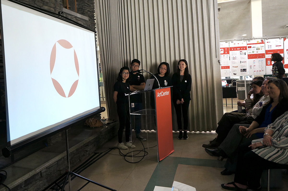
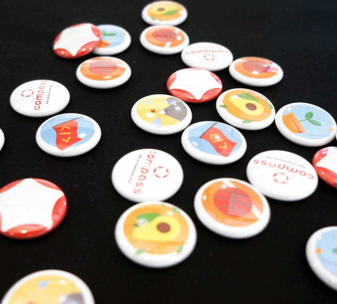
Compass
interaction. branding.
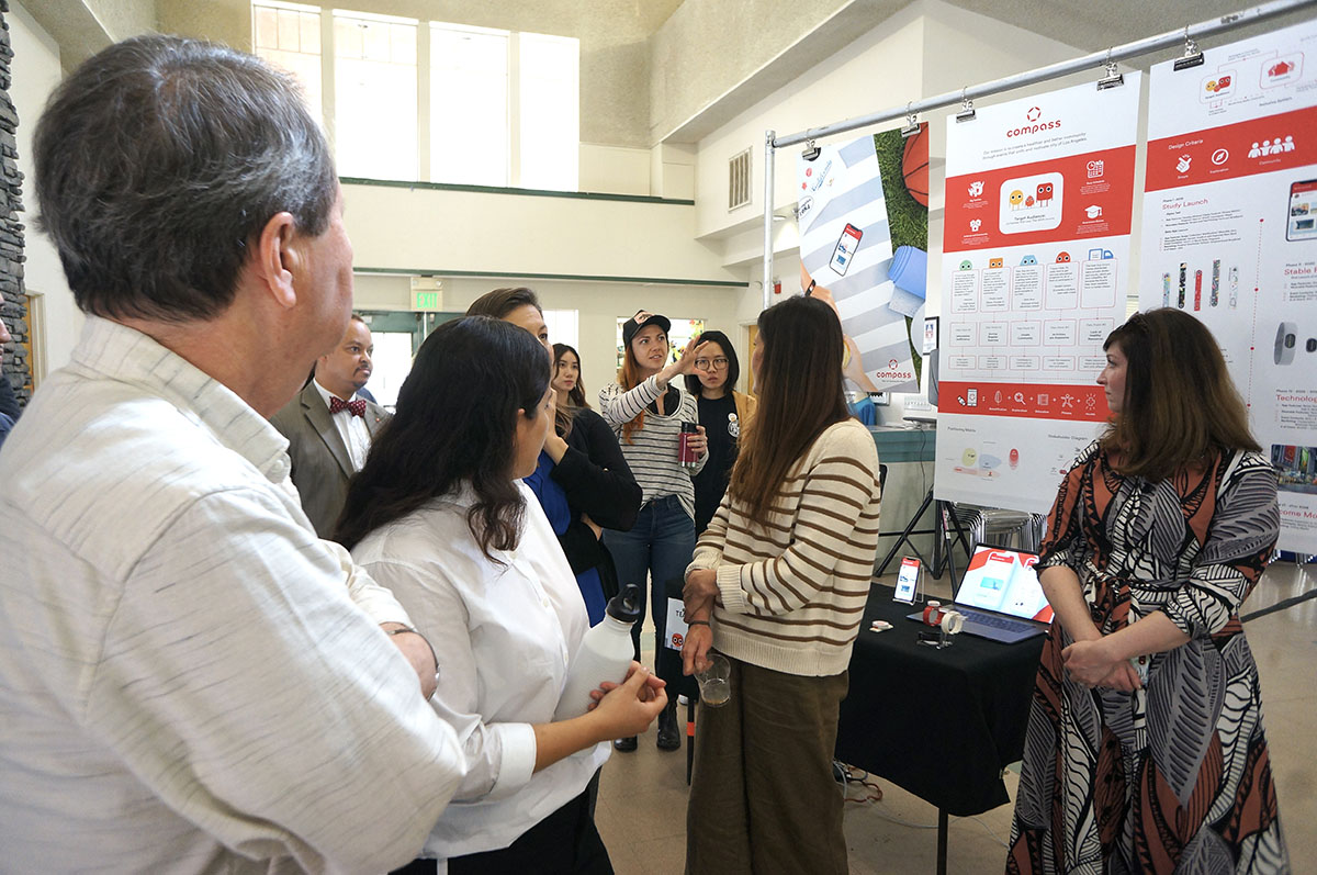
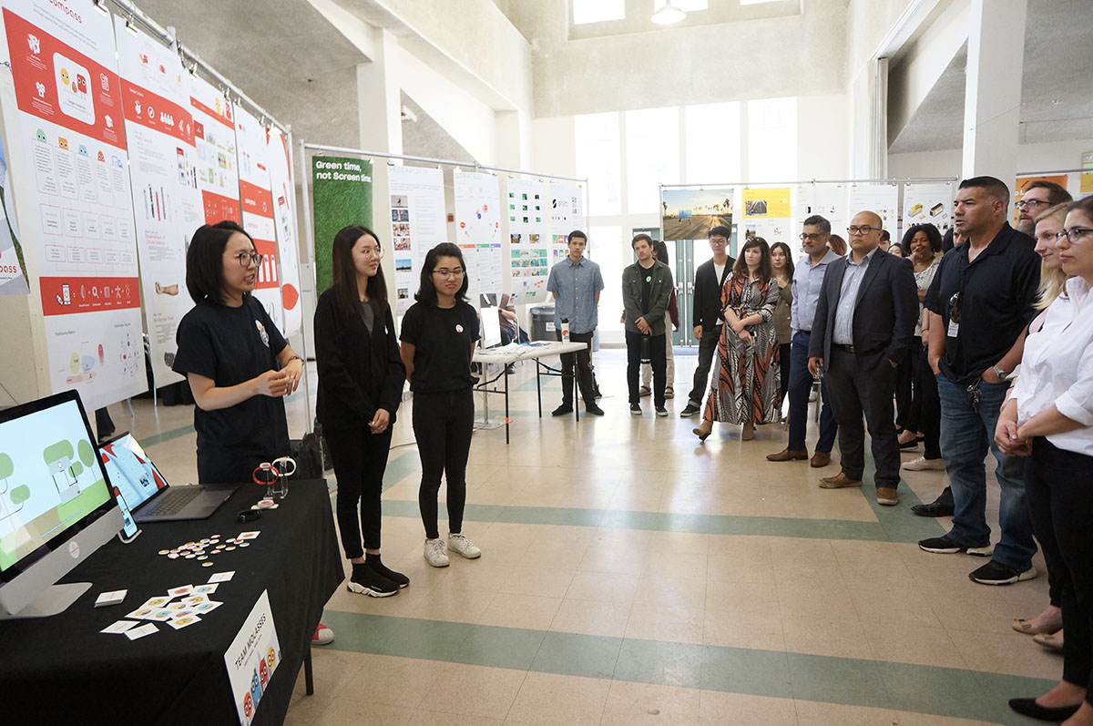
Compass is a community based event platform that promotes the health and wellness of Los Angeles in preparation for the LA 2028 Olympic games.
In active collaboration with Cedars-Sinai Research Center for Health Equity, Los Angeles Department of Recreation and Parks (RAP), Discovery Science Cube Los Angeles, and Garmin International presented the challenge of starting a city-wide health initiative to create a culture of healthy, active and engaged communities for all residents of Los Angeles in preperation of the 2028 LA Olympics.
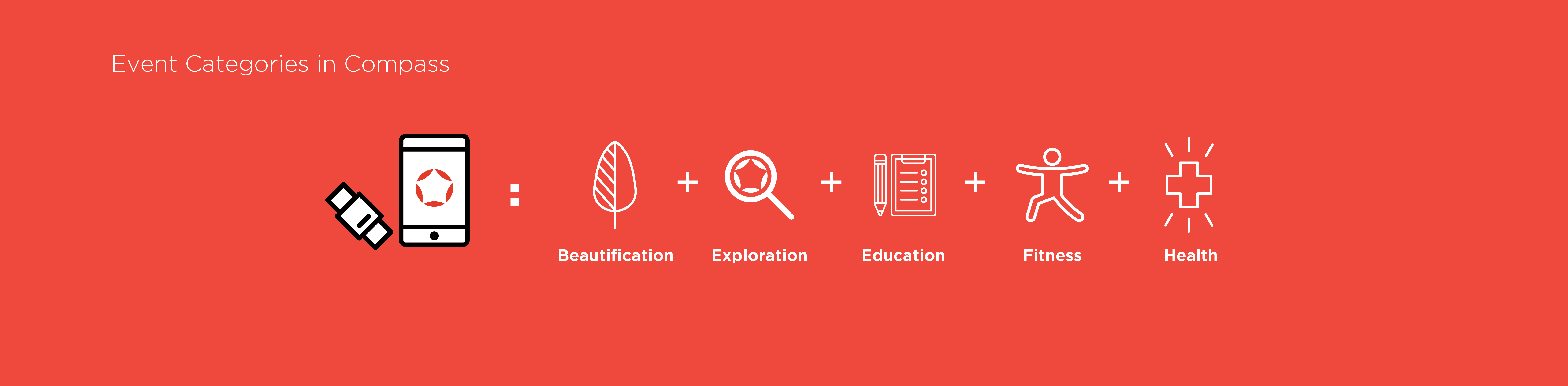
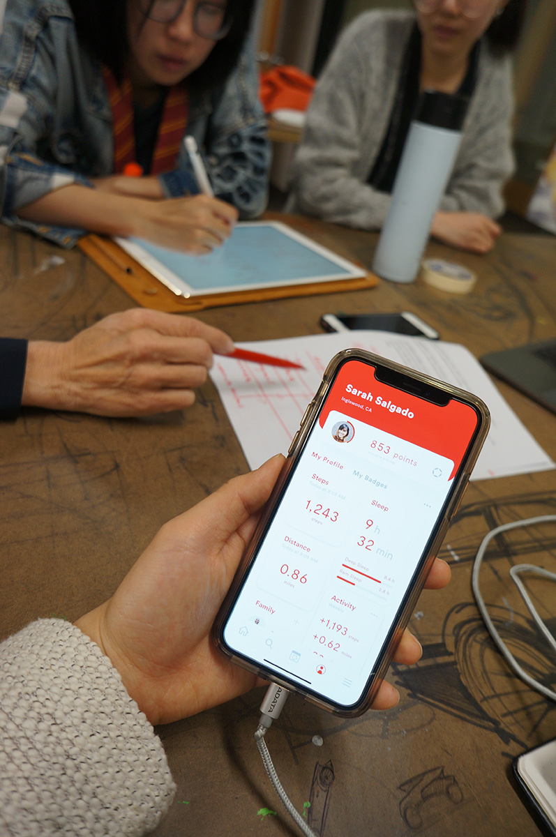
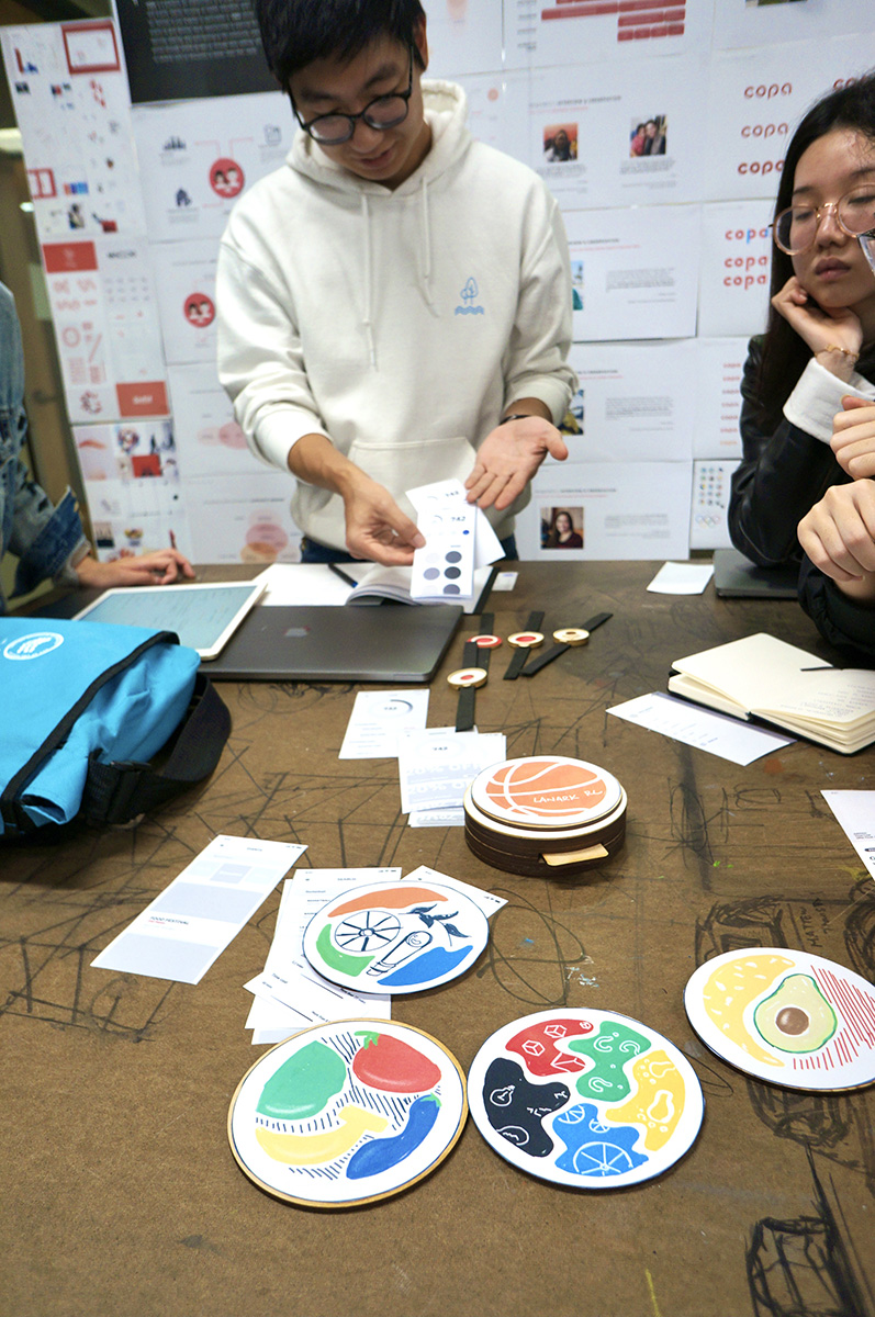
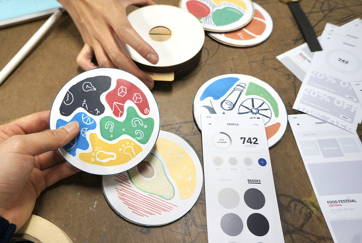
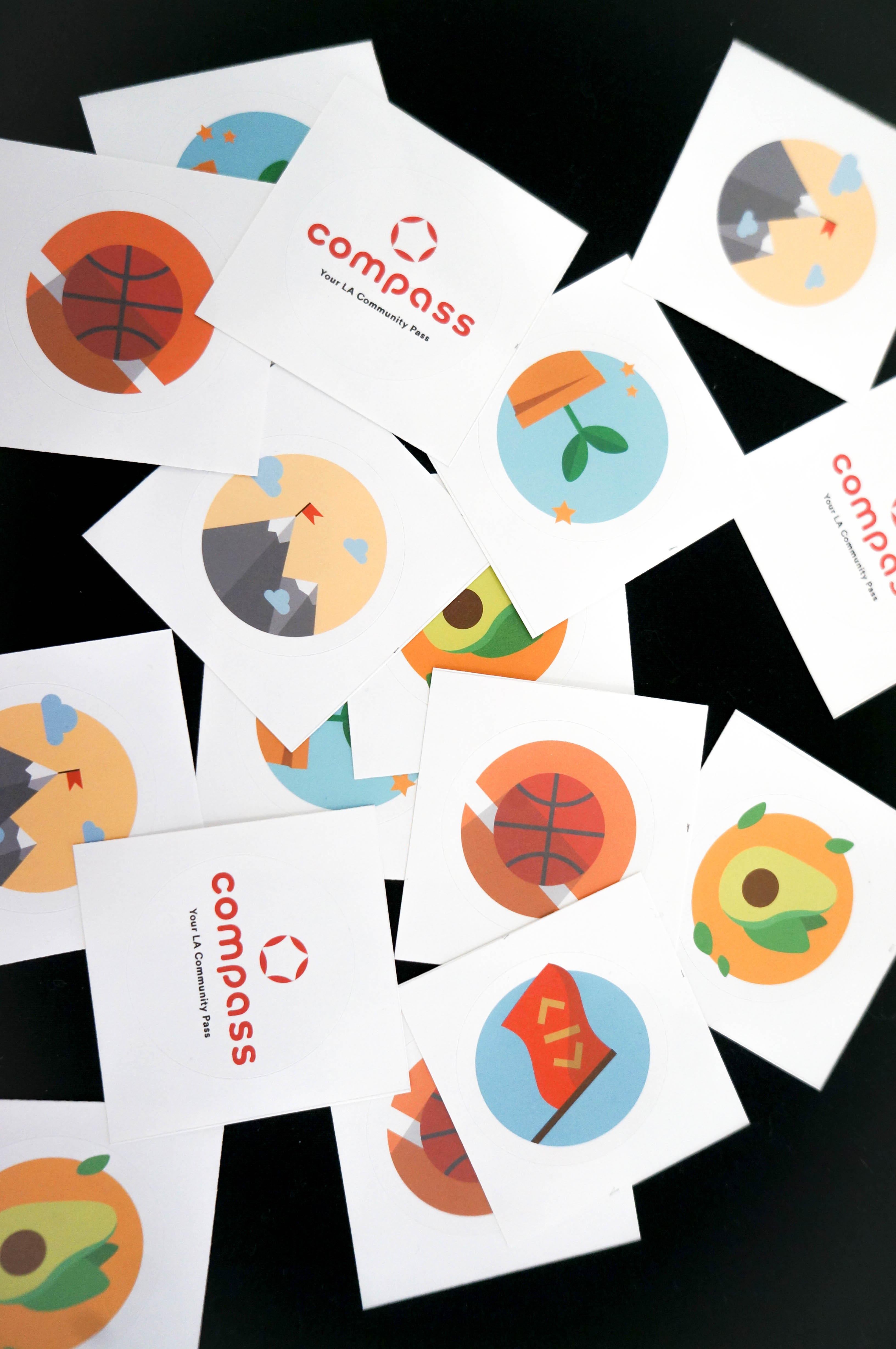
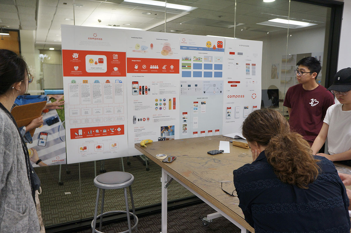
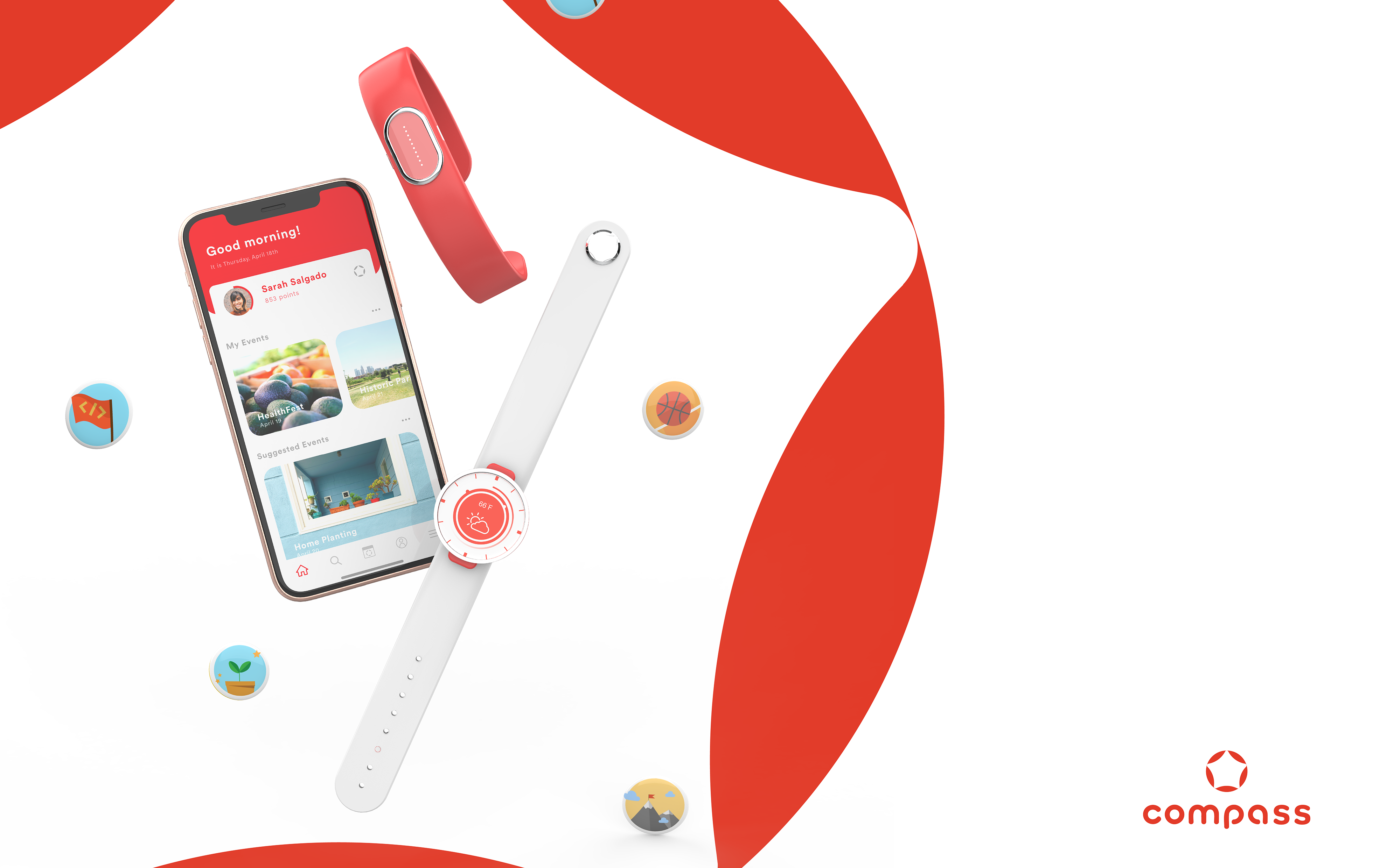
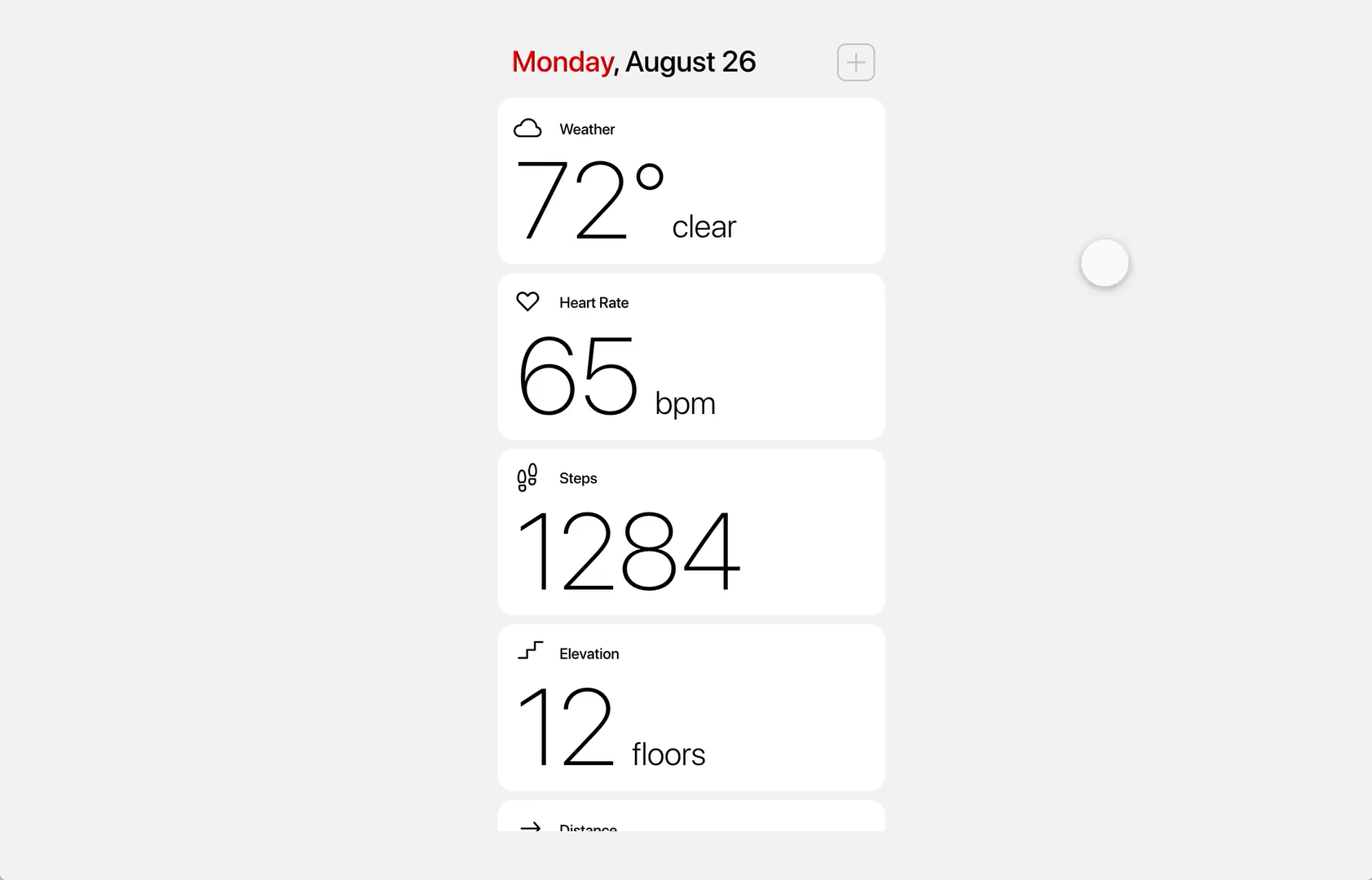
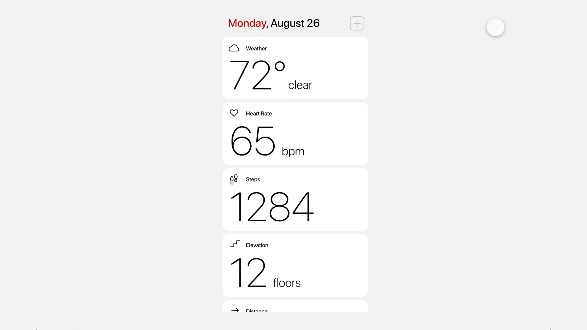
Compass was created as a physical system that utilizes existing resources of LA Rec and Parks in a new and collaborative way that emphasized education, exploration, beautification, fitness, and health. The integration of an accompanying digital system is used to provide clear information and keep track of their physical activities.
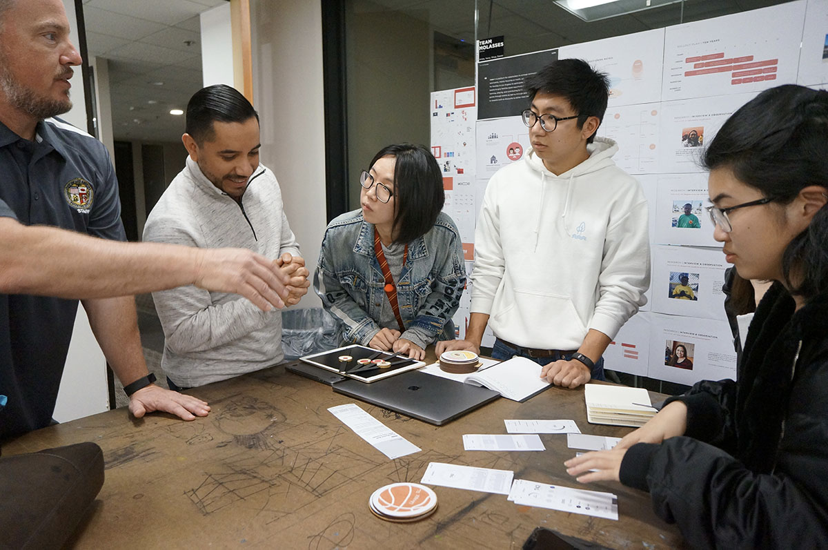
My responsibilities included field research, identity design, interface design, prototyping, photography, sound development, storyboarding, and collaboration in motion design.
Team Members:
Daniel Kim, Kristy Cheng, Yanqi Li, Shiya Zeng
User Senario
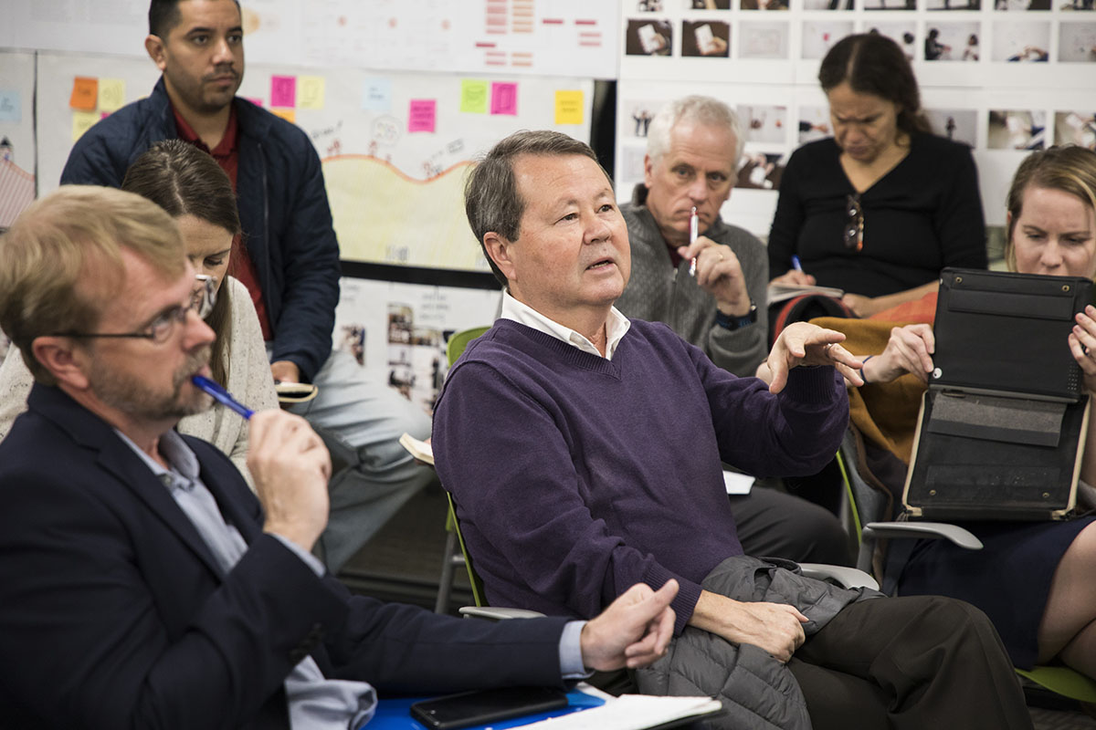
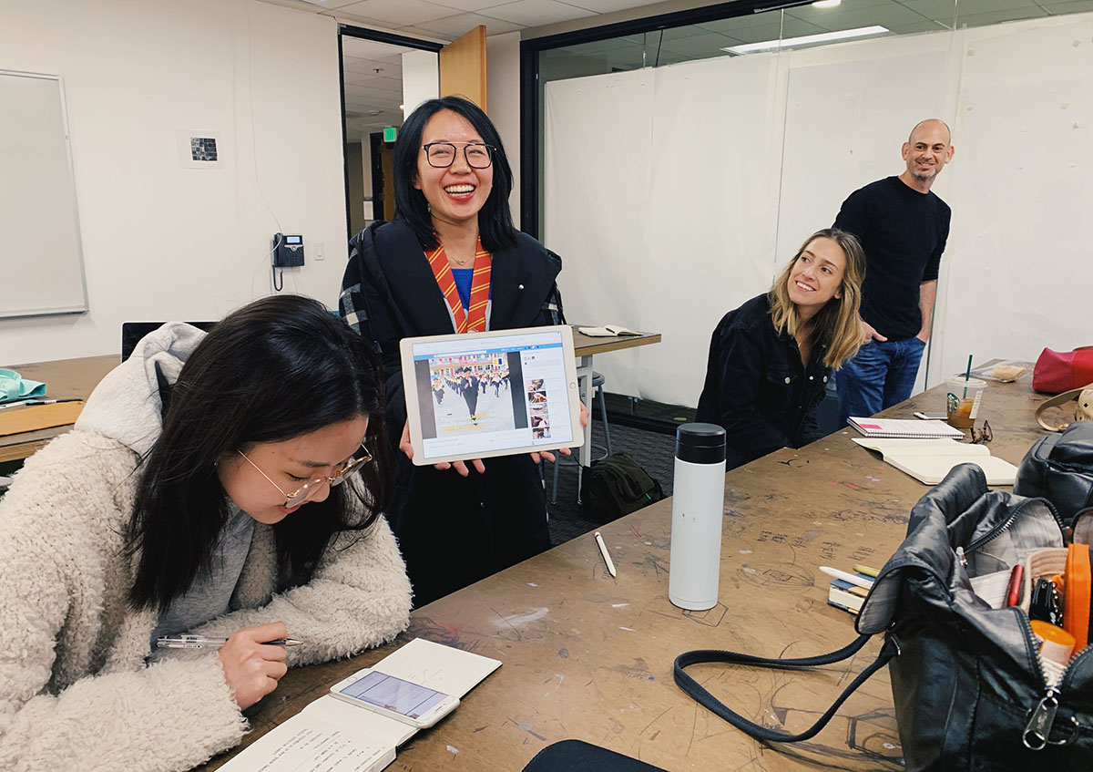
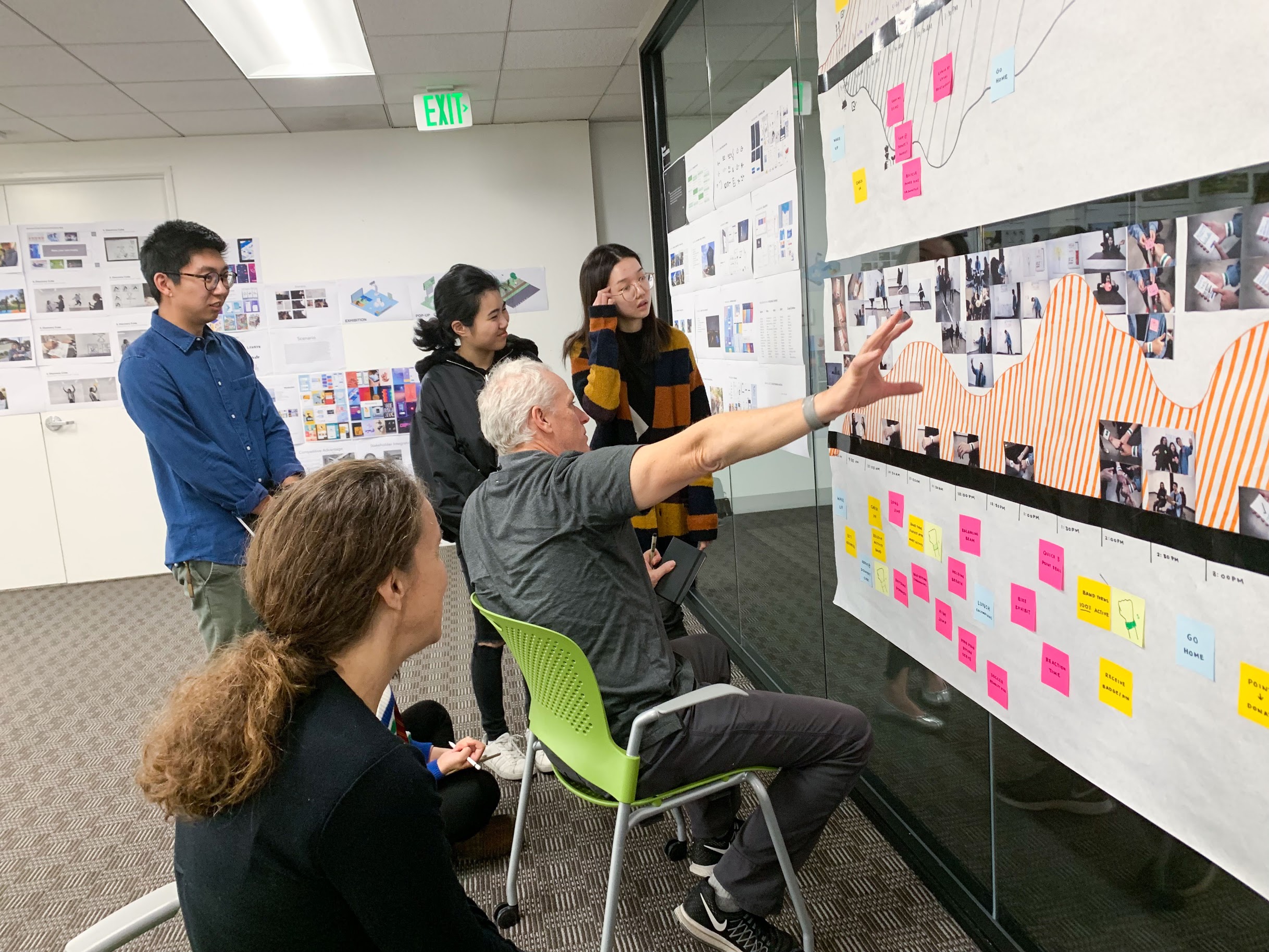
Research
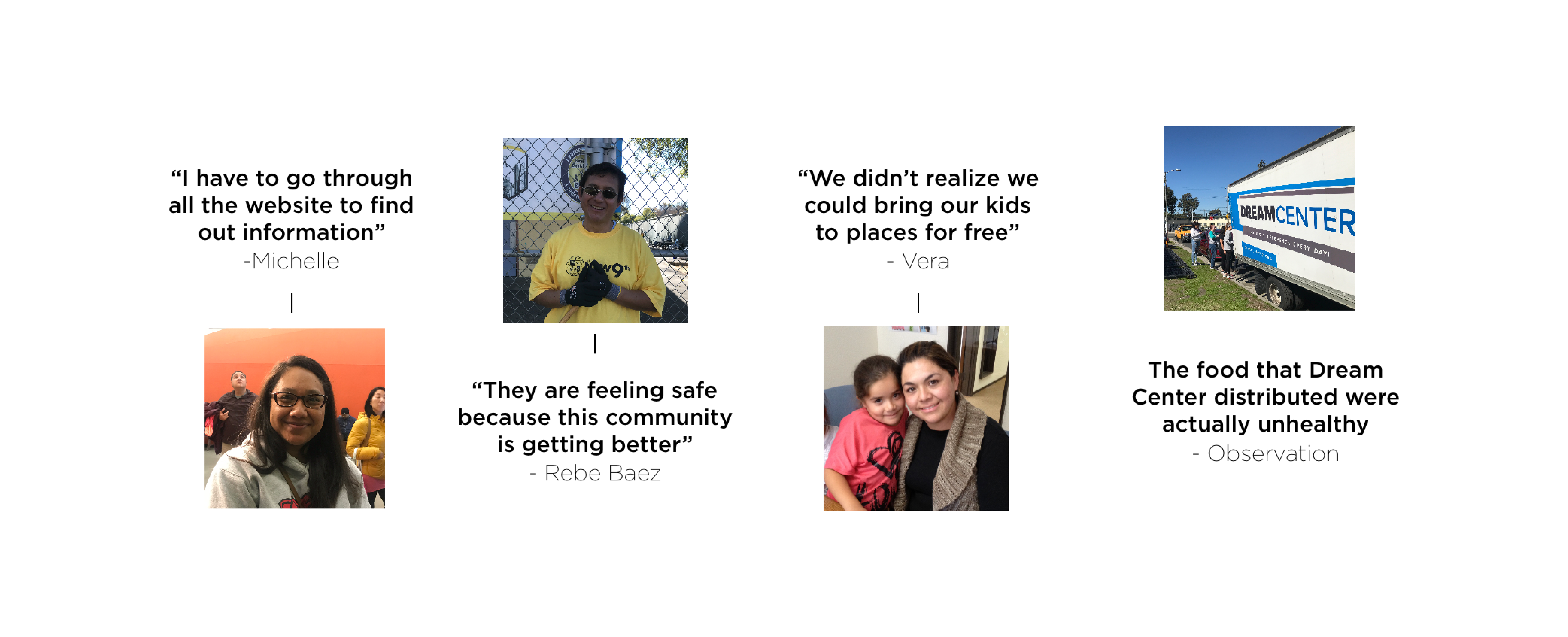
Through in-depth research and user testing, there was an opportunity to increase the health and wellbeing of a larger population of Angelinos, who also happened to be those within a lower wage bracket.

Interviews


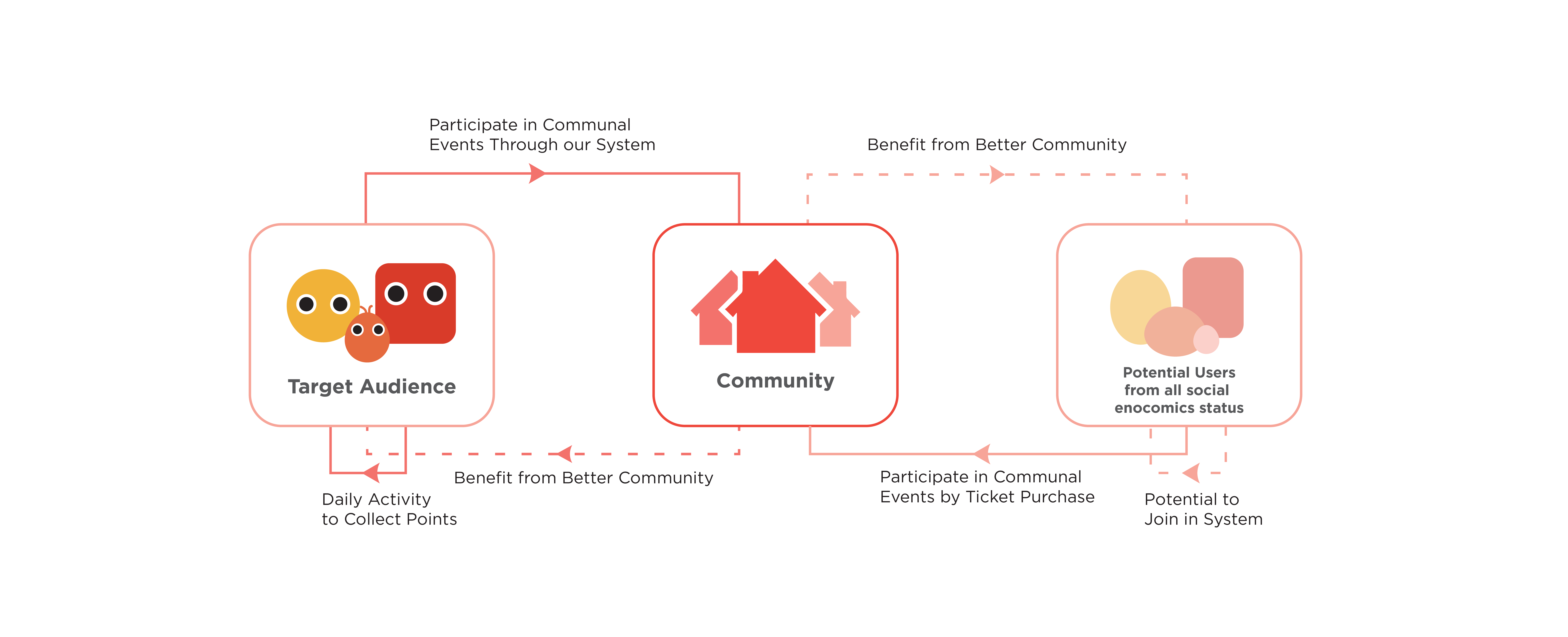
 Ecosystem
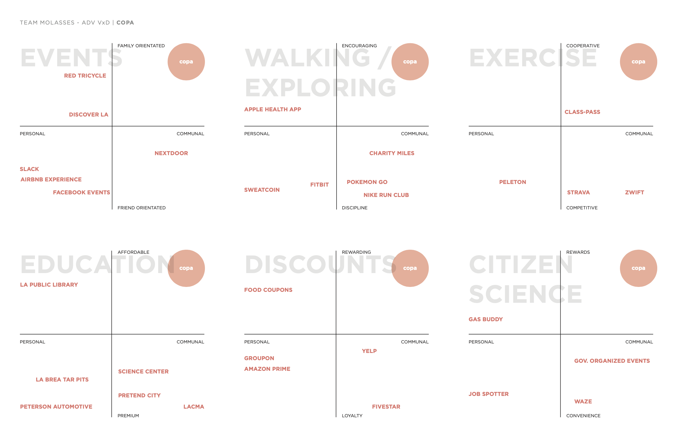
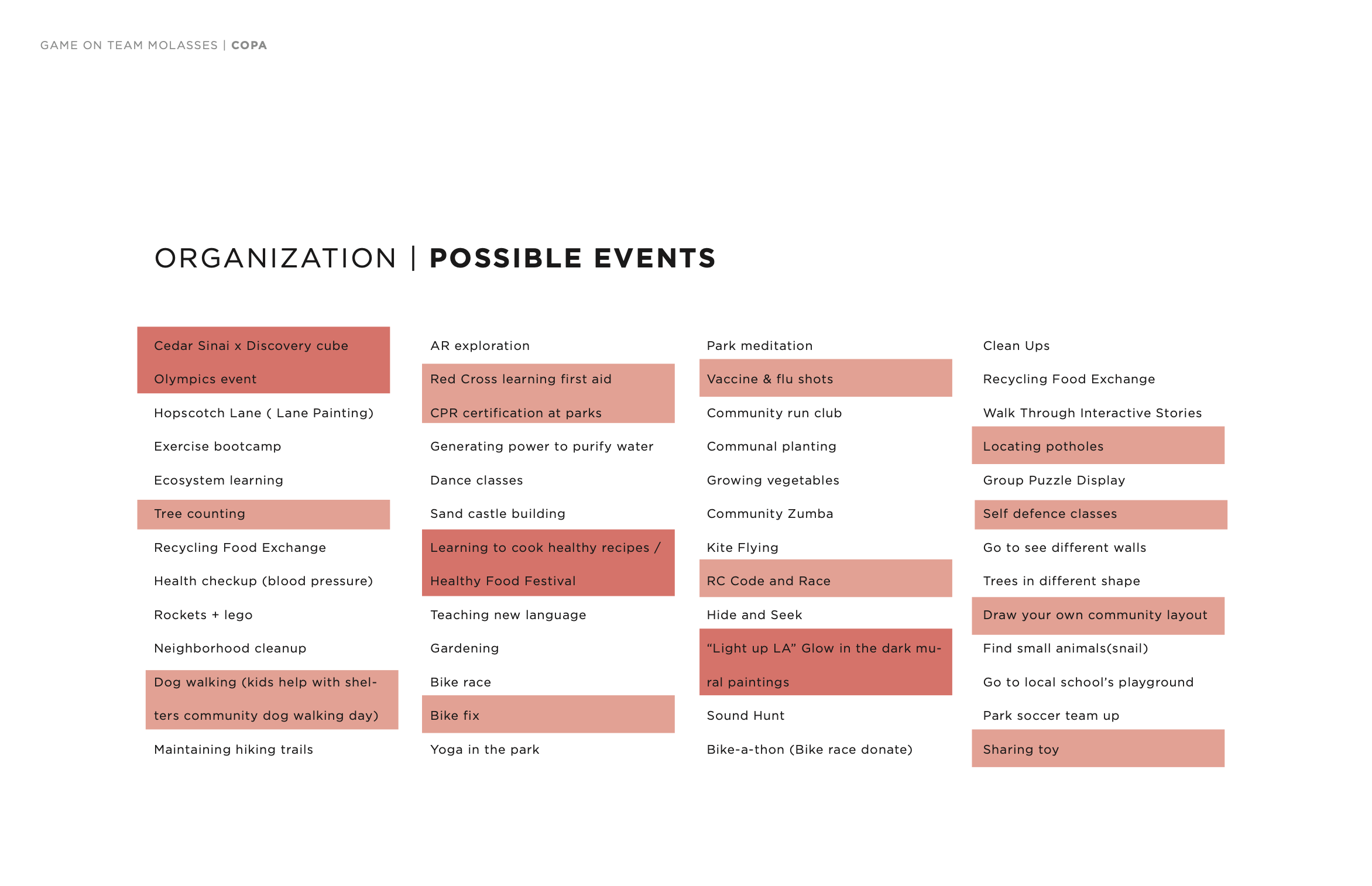
Compass is more than a fitness platform or a community events page. Compass utilizes the existing infestructure and facilities of the City of Los Angeles of Recreation and Parks, while expanding the wellbeing of the community beyond physical activity and into avenues of education, beautification, and exploration.

Mobile Interface
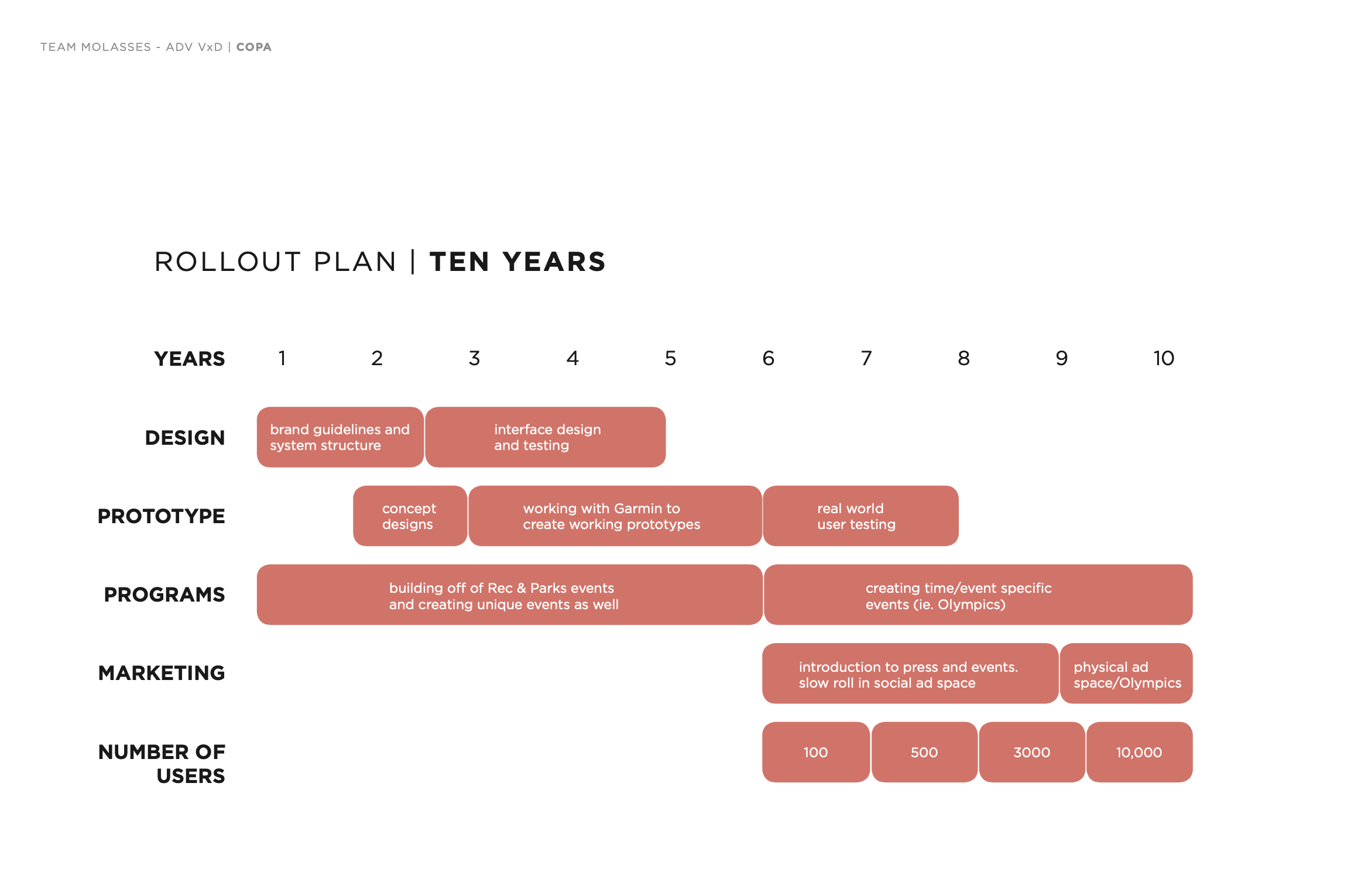
 10 Year Rollout Plan
 Process


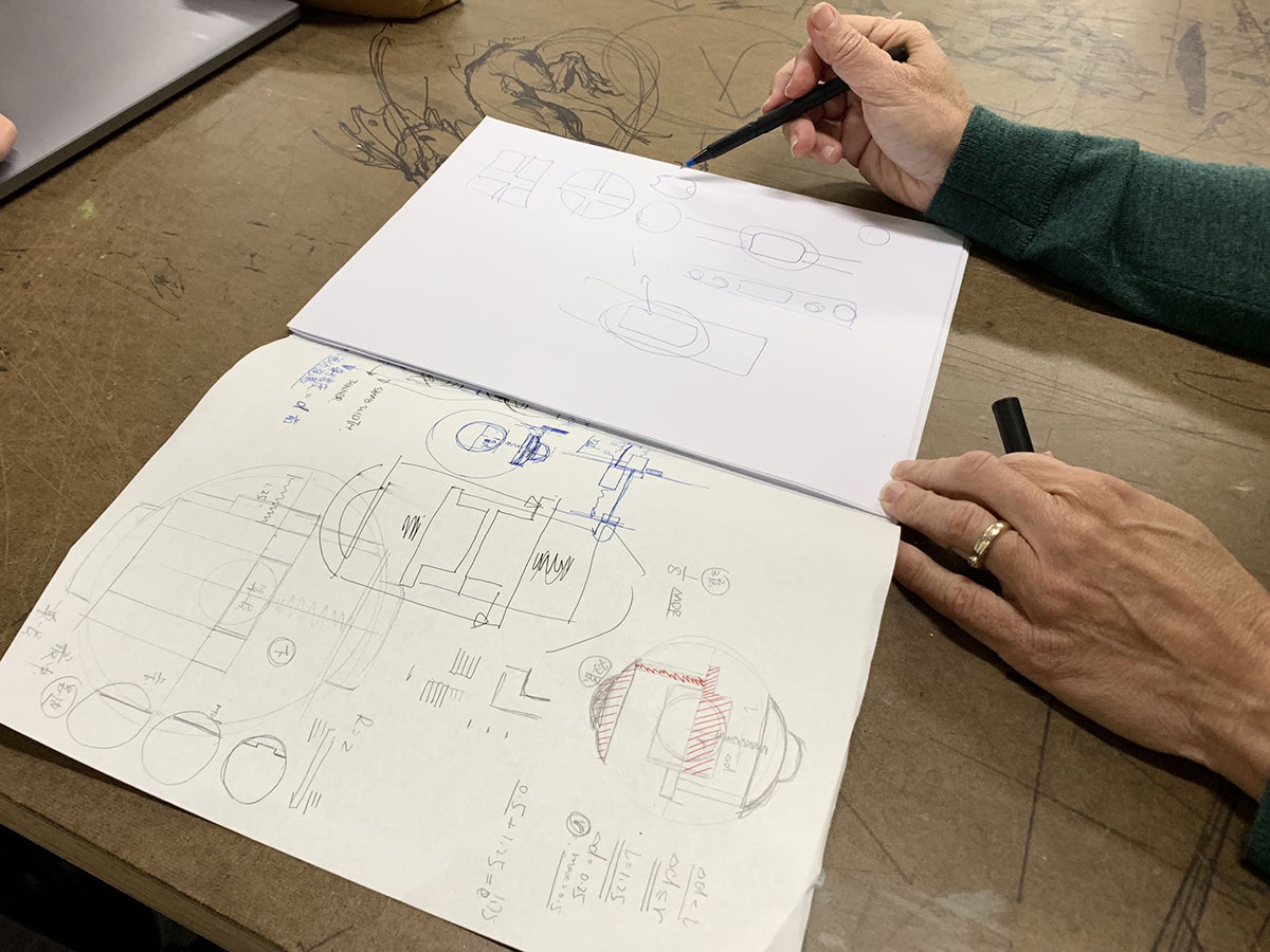

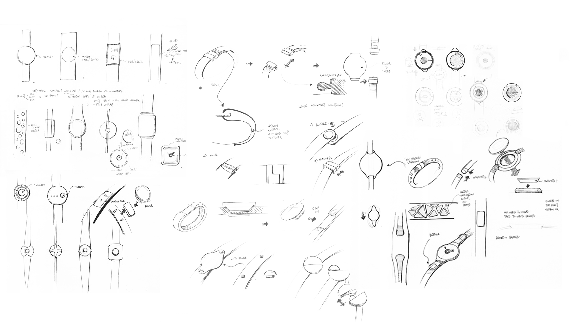
Wearable Technology
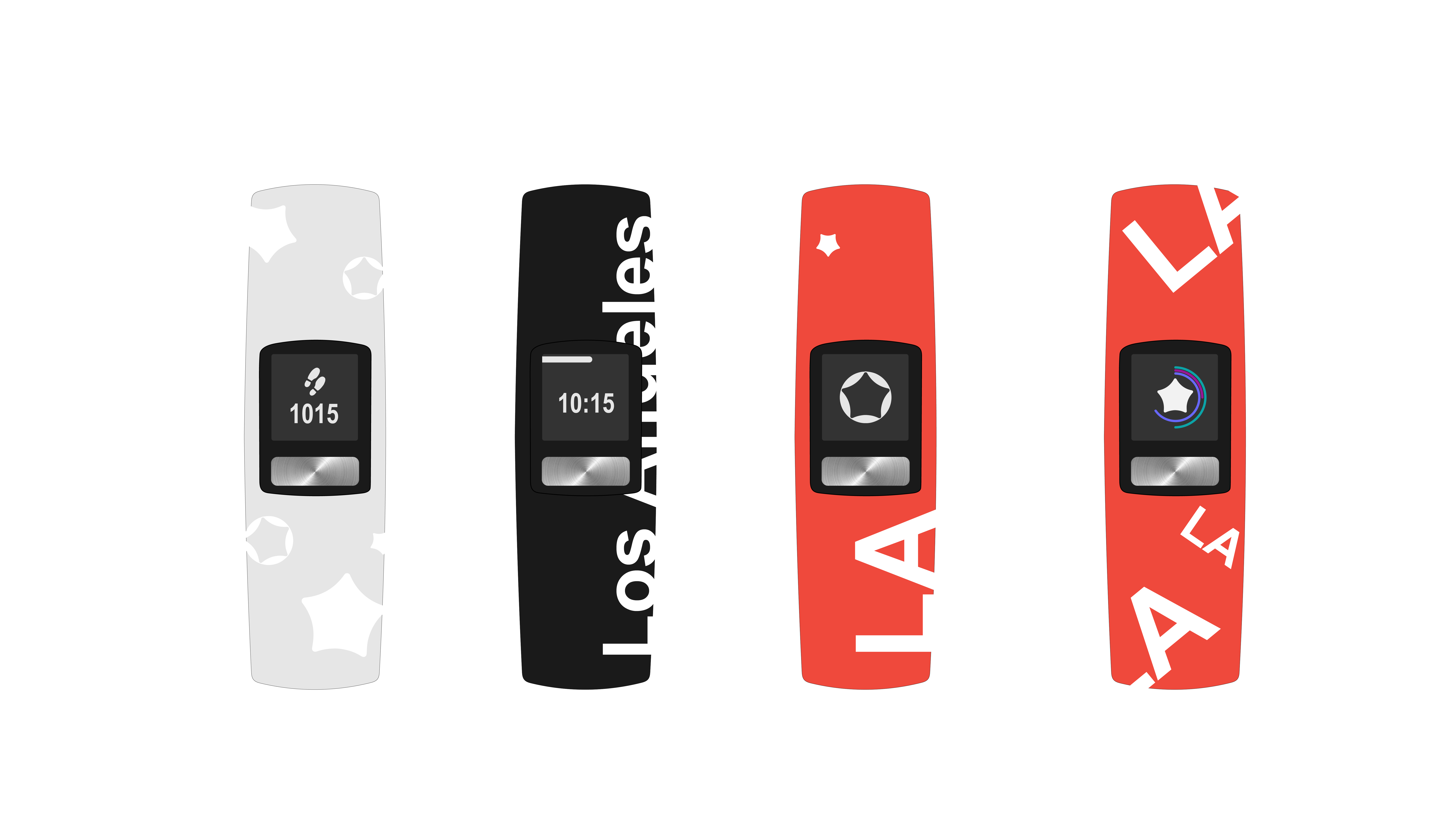
First Generation - Garmin Vivofit 4 with Compass Livery
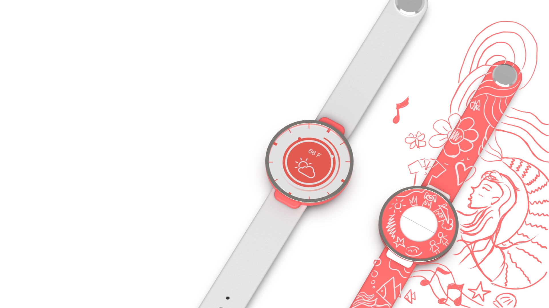
 Second Generation - Customizability and Simplicity
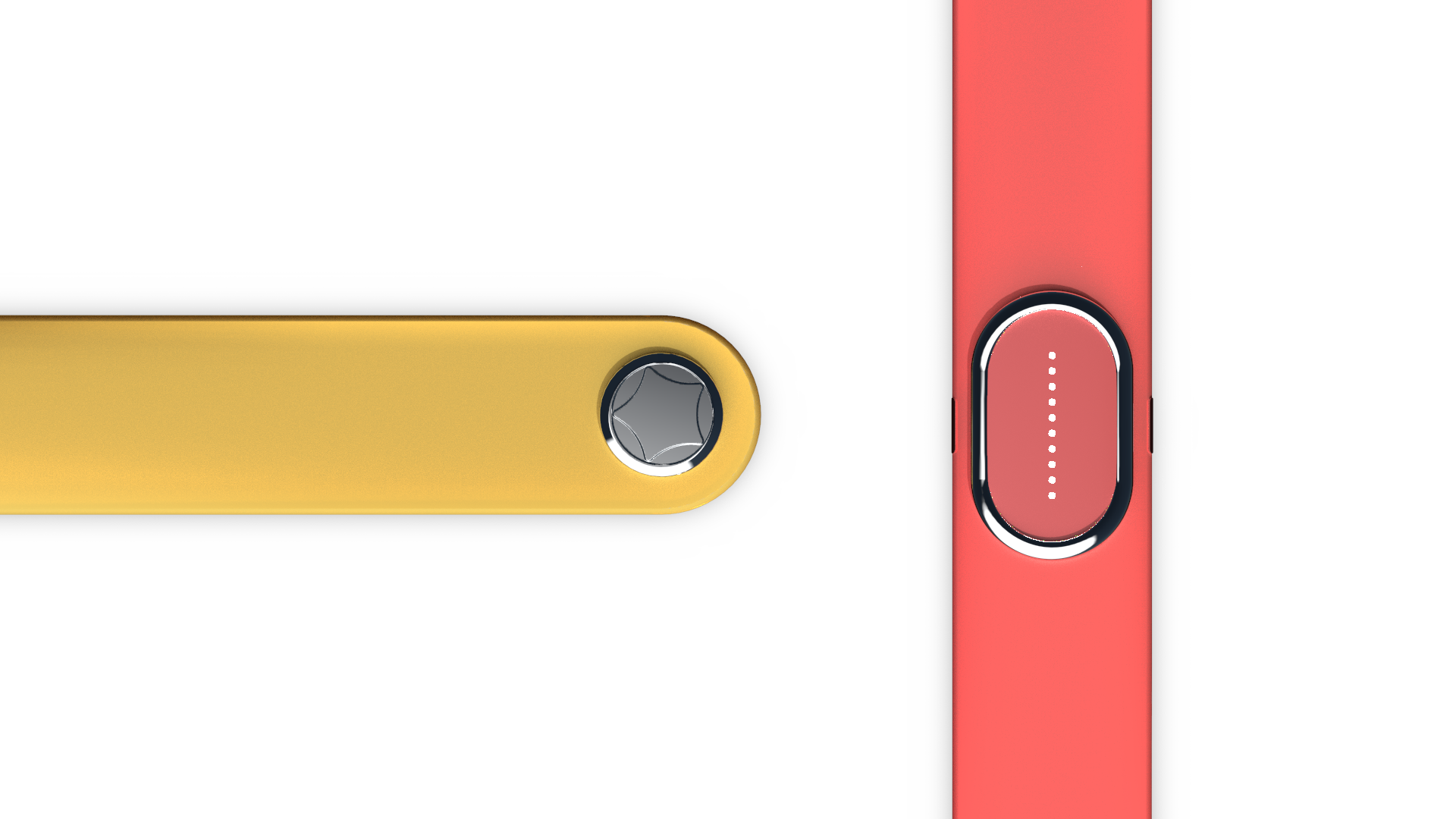
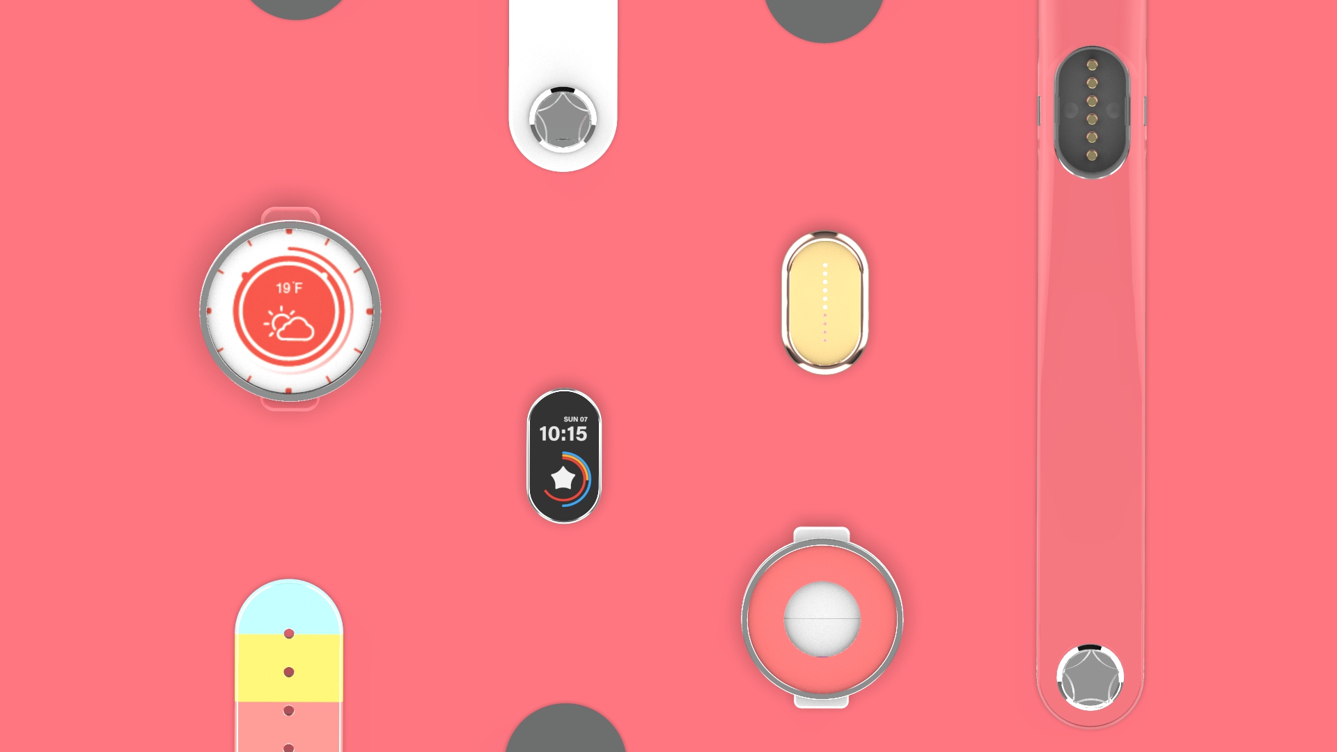
Third Generation - A Modular Family
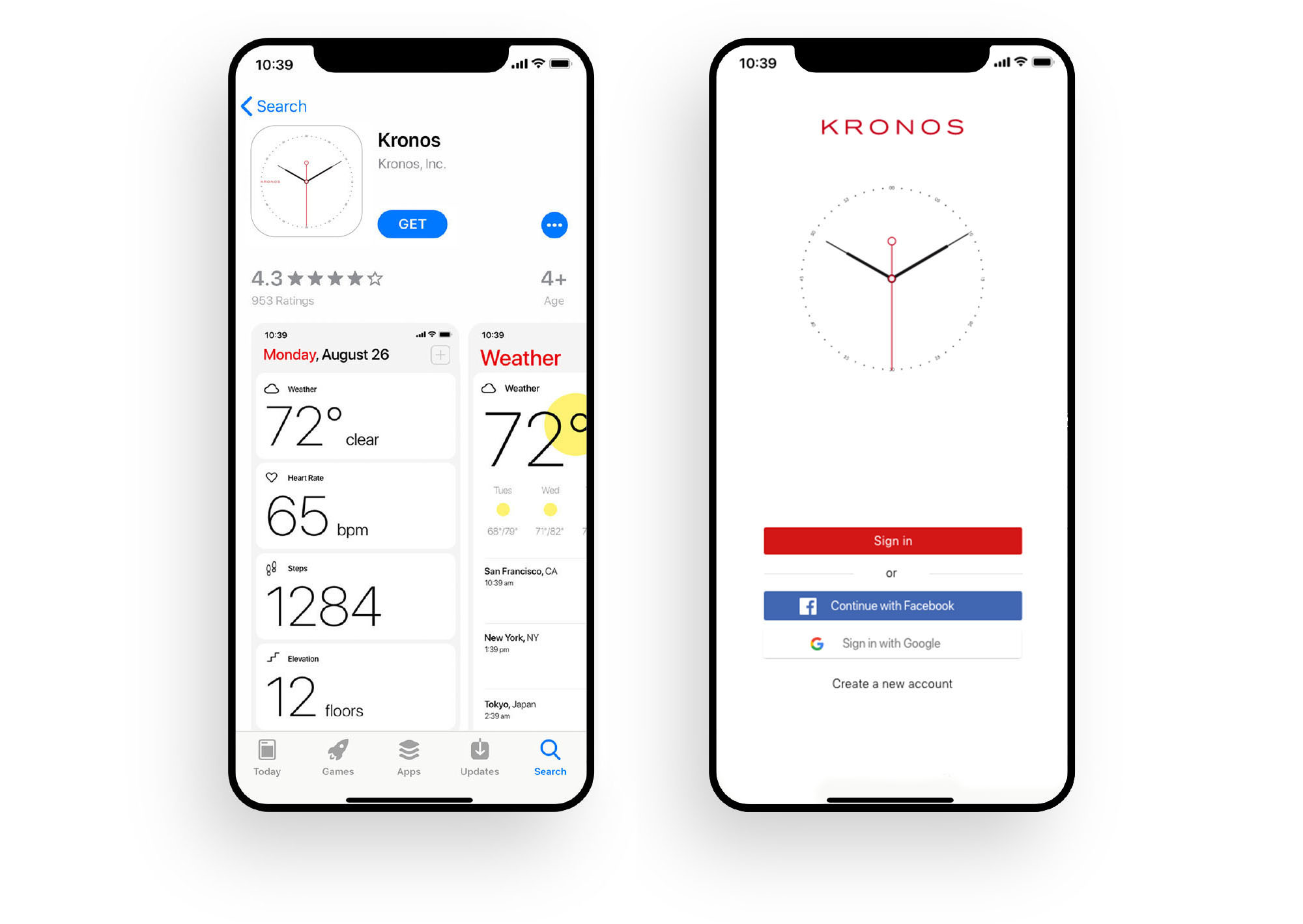
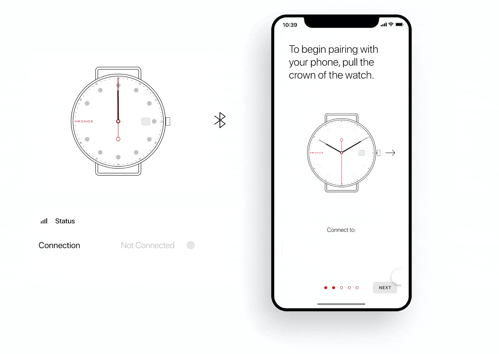
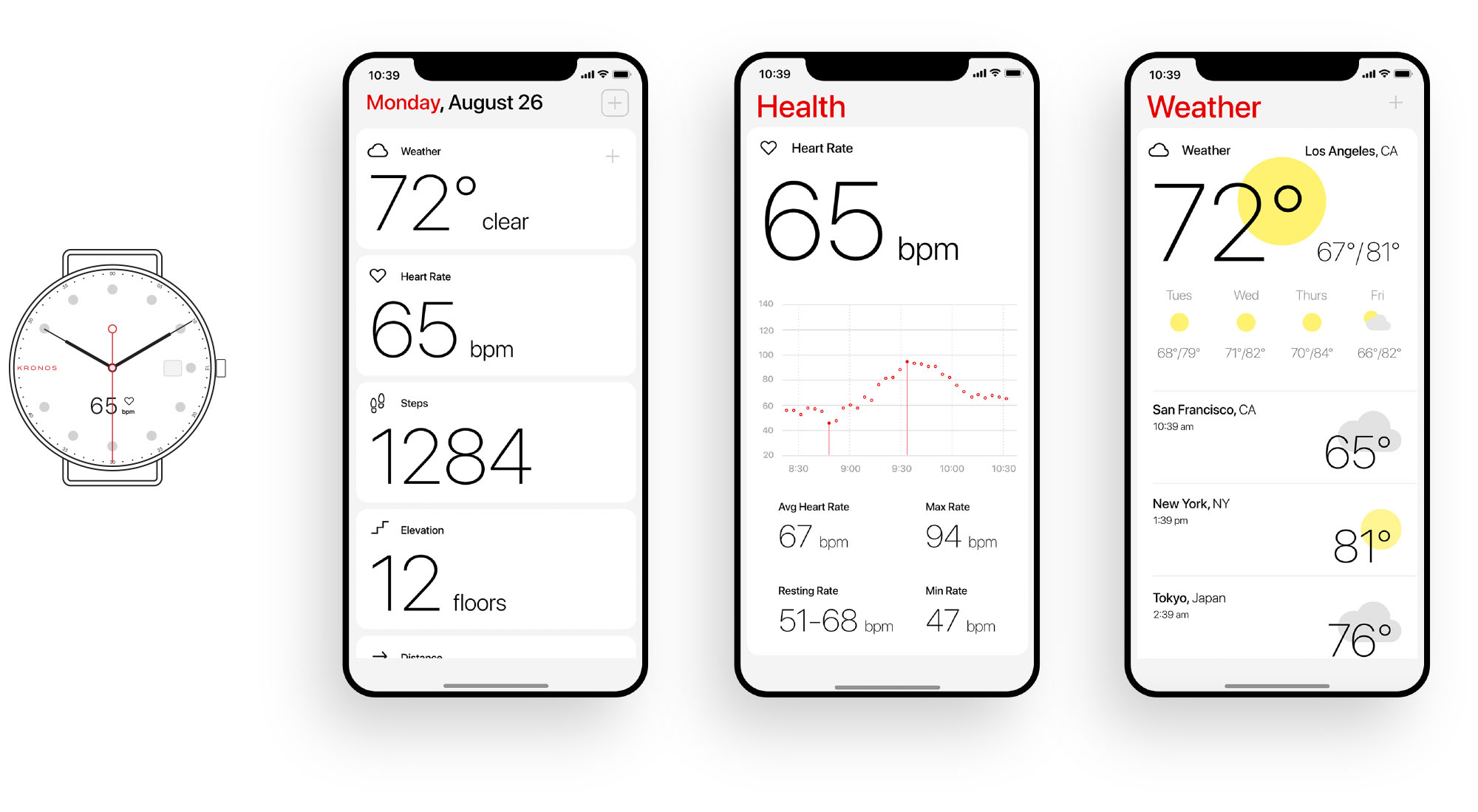
Kronos
interaction. branding. 3d.
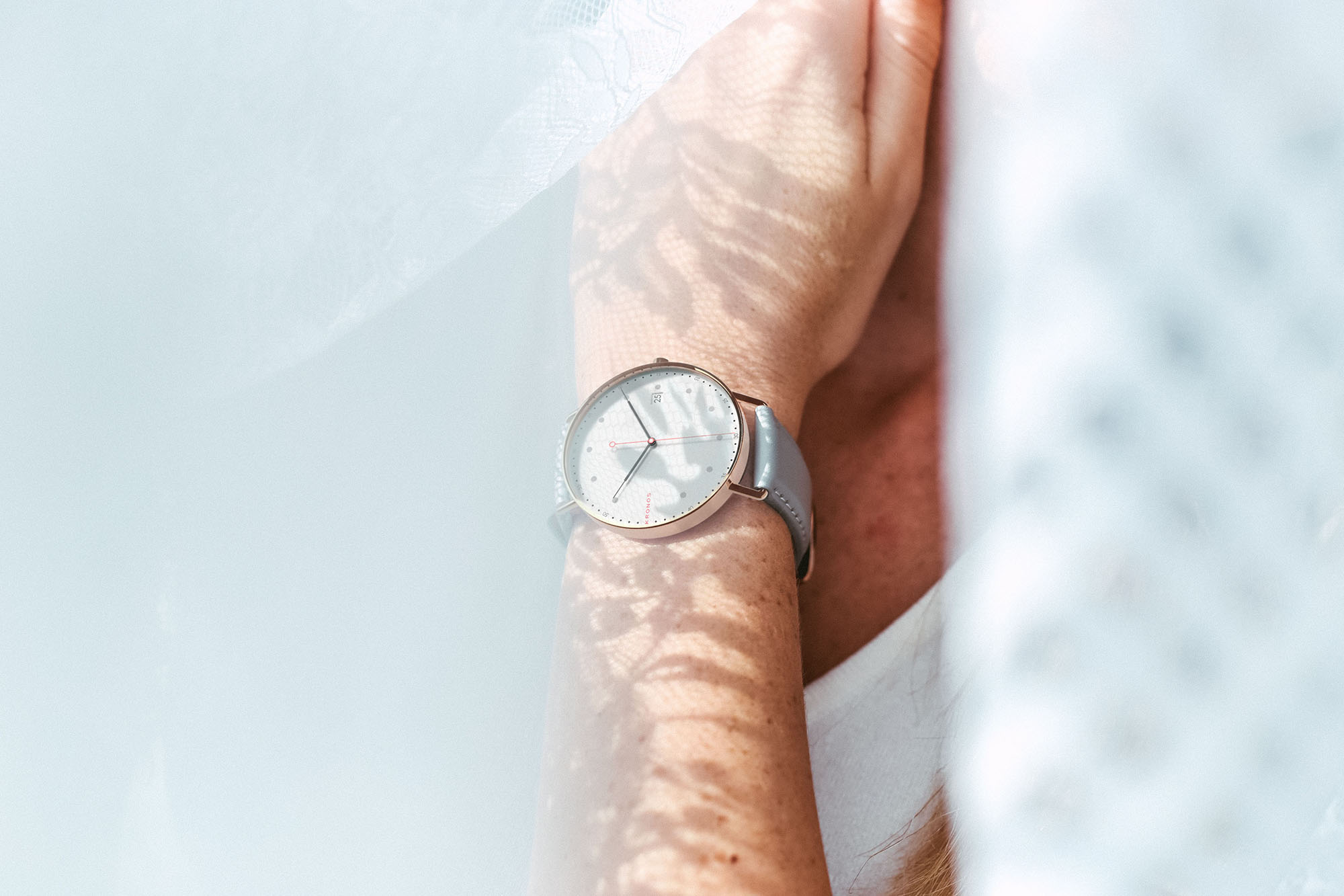
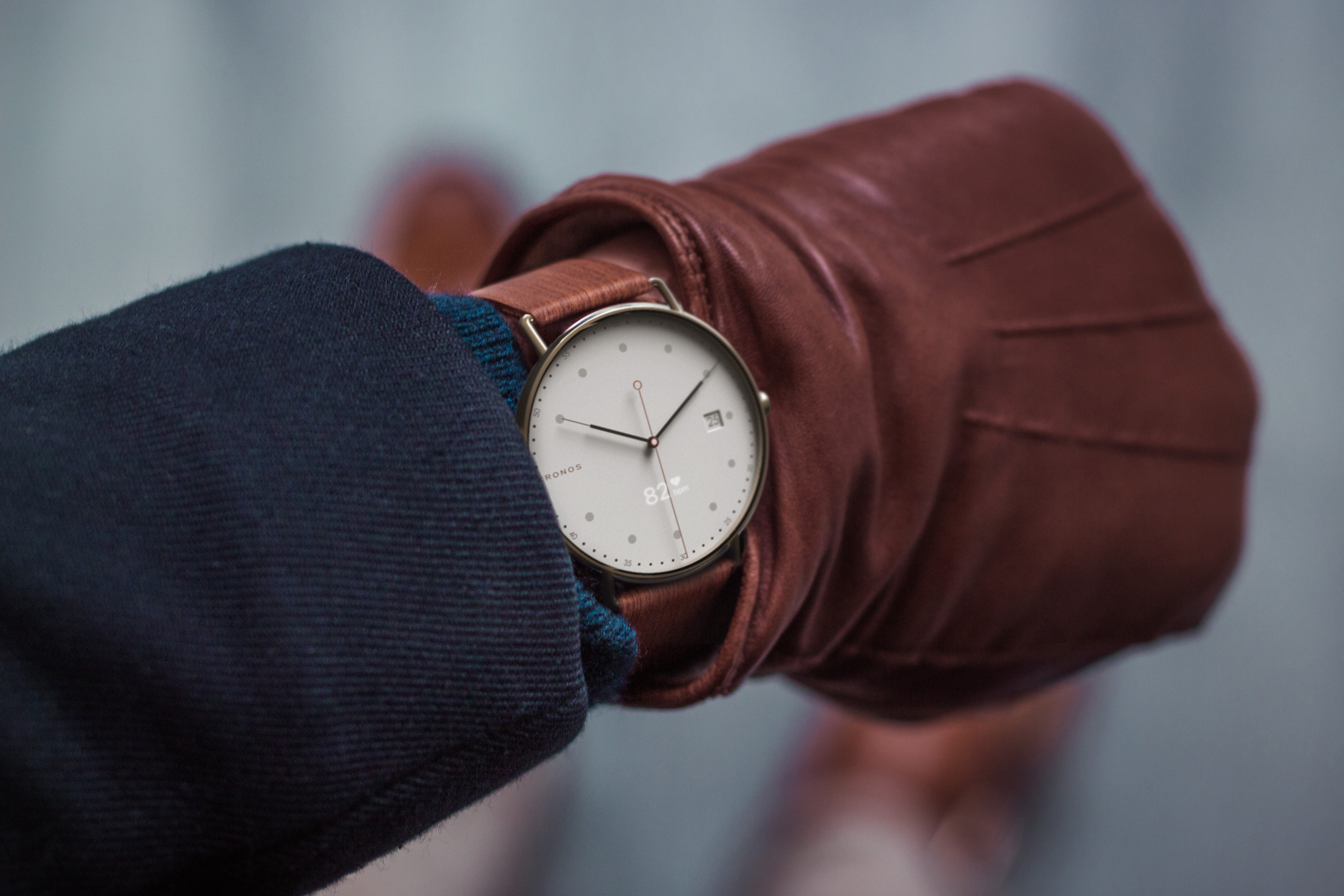
In Greek mythology, Cronus or Kronos was the leader of the Titans and god of time.
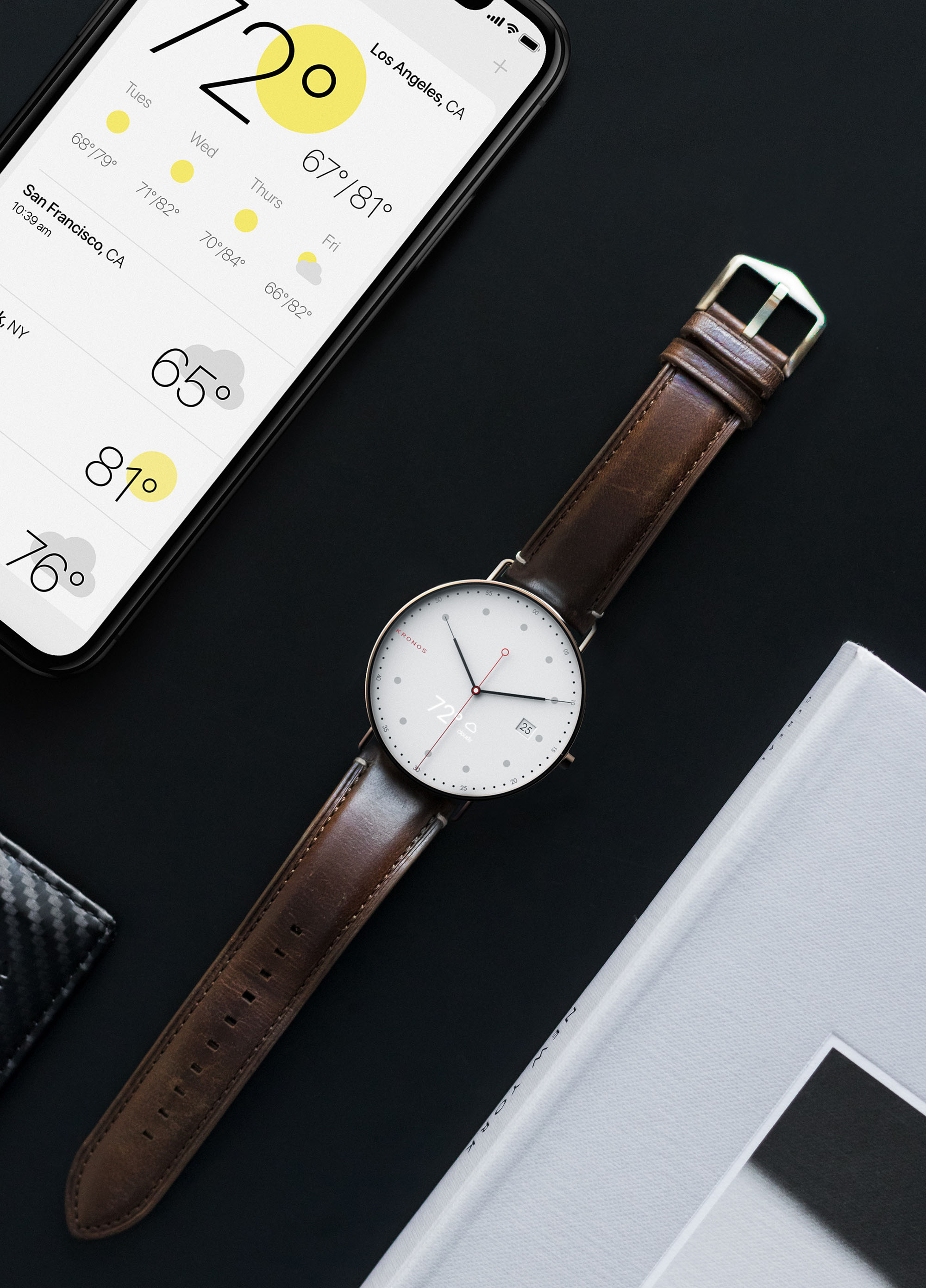
Kronos is a classical Bauhaus designed analog watch that is sprinkled with modern technology that elevate it into today’s digital age. Underneath the minimal face lies real time health monitoring systems, subtle notification alerts, and a seamless OLED display that can be toggled on and off.
The Kronos mobile app was created to complement the minimal design language, as well as extend the customization of the watch itself.
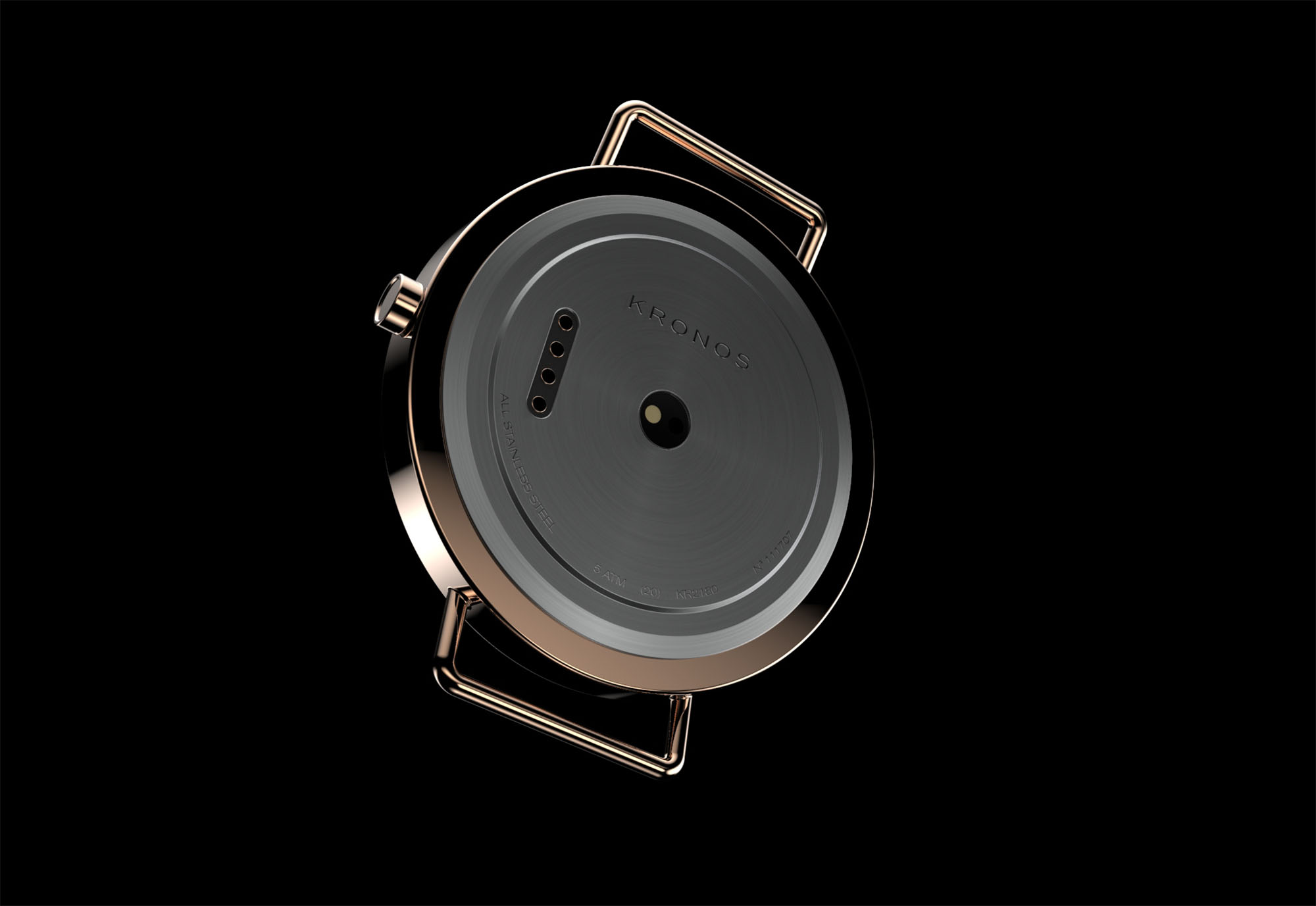
SolidWorks and Keyshot were used to model and render the Kronos line of watches.

App Walkthrough
A high-fidelity prototype that shows the process of onboarding and pairing, exploring different widgets, and tailoring the Kronos app to the individual needs of the user.
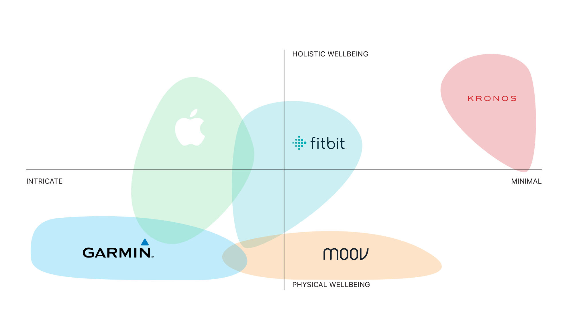
Positioning Matrix
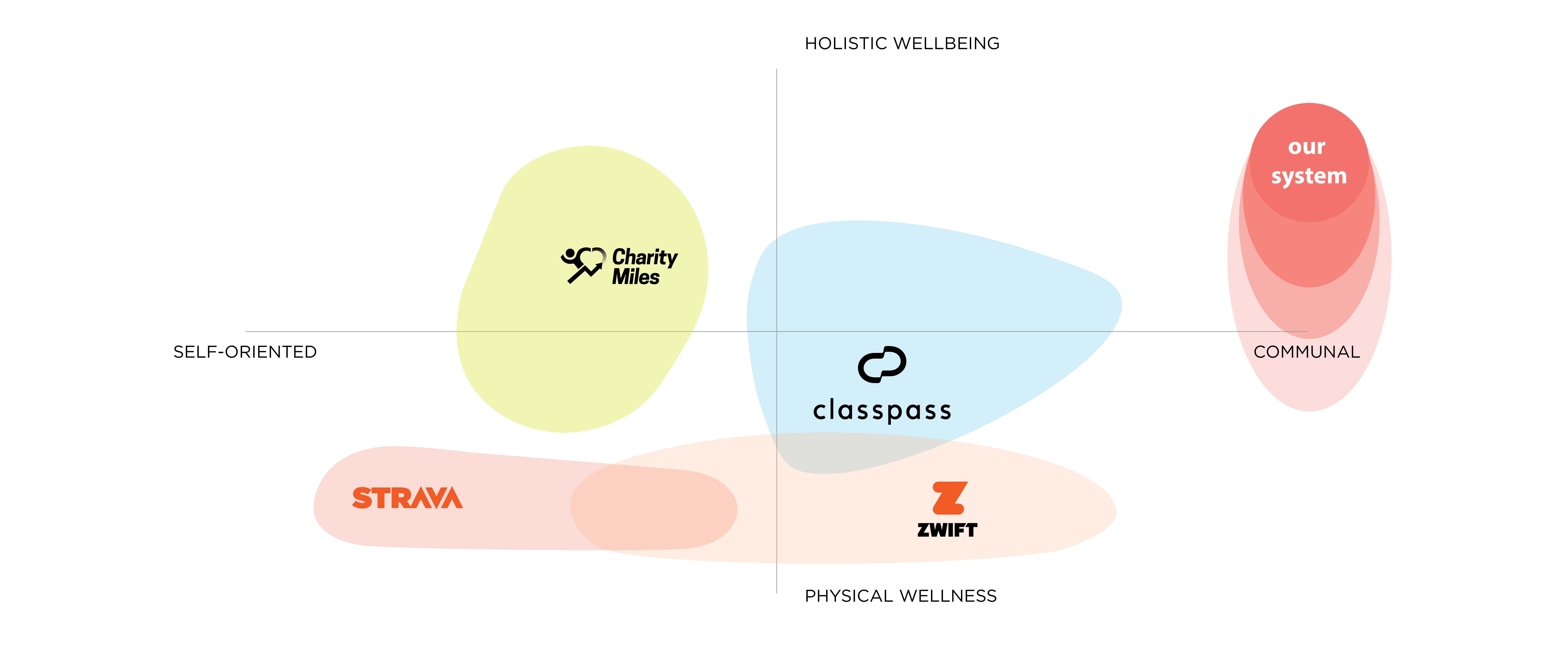
The current market of activity trackers are positioned towards athletic users, offering dozens of sport tracking capabilities. Though valuable to some, by maintaining only the bare necessities, Kronos is able to appeal to everyday users and refine a simplier system.
 System Structure
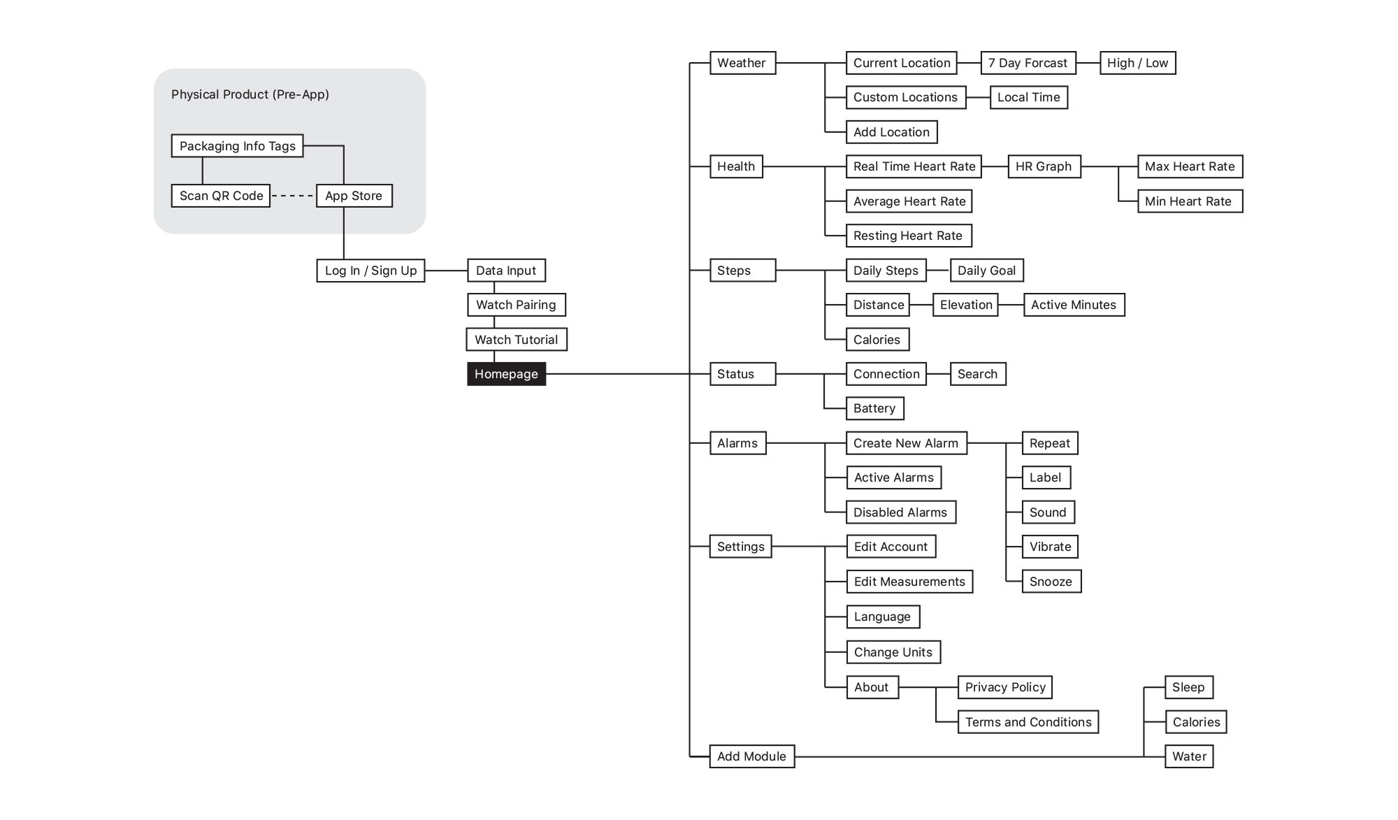
 Prototyped Interactions
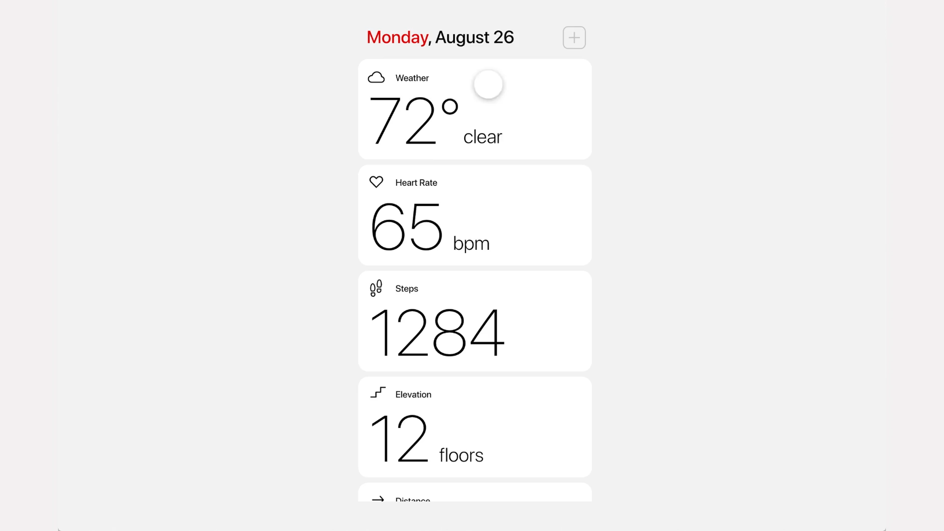

Product Renderings


Design System
Juilliard School of Music
branding. print. interaction.
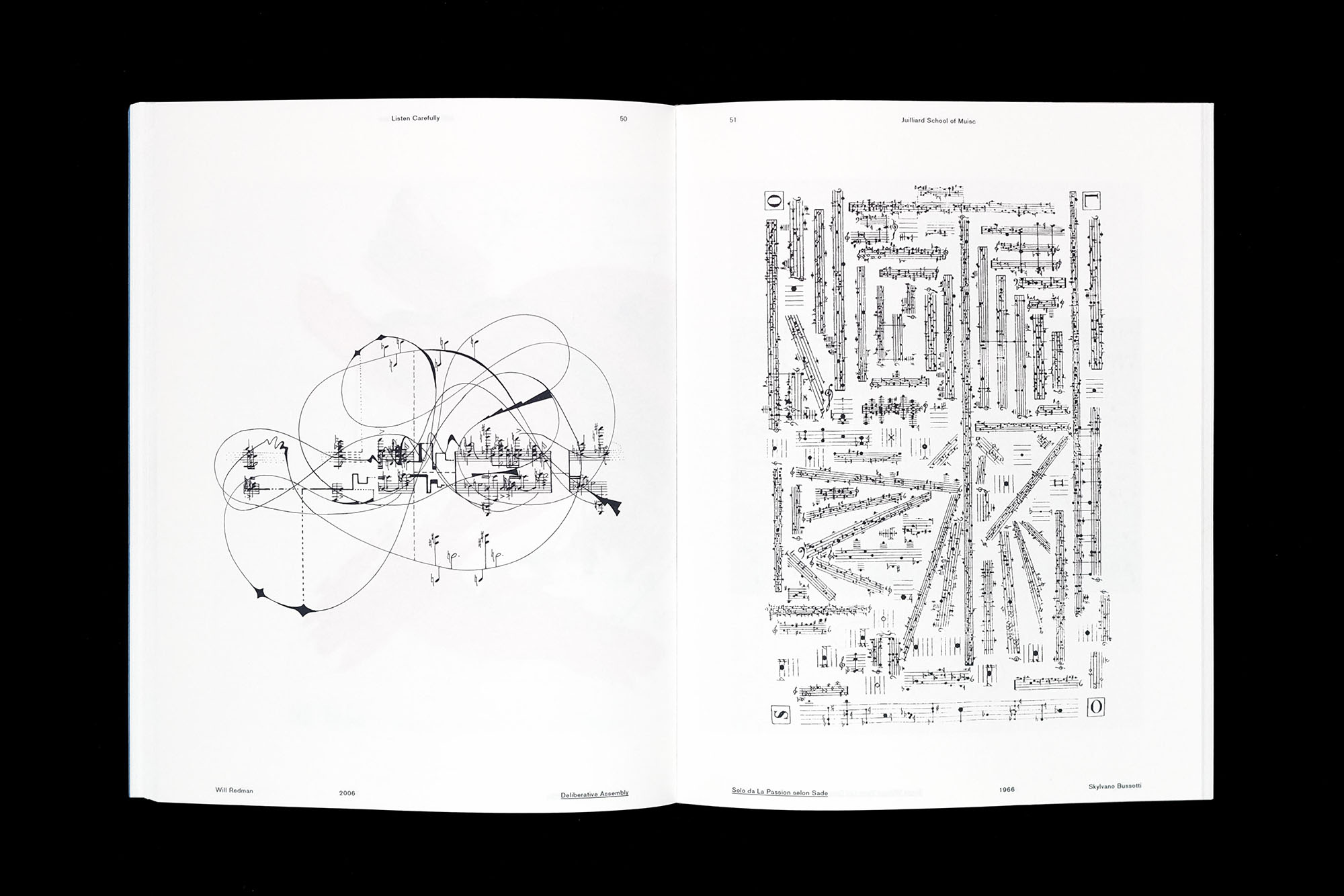
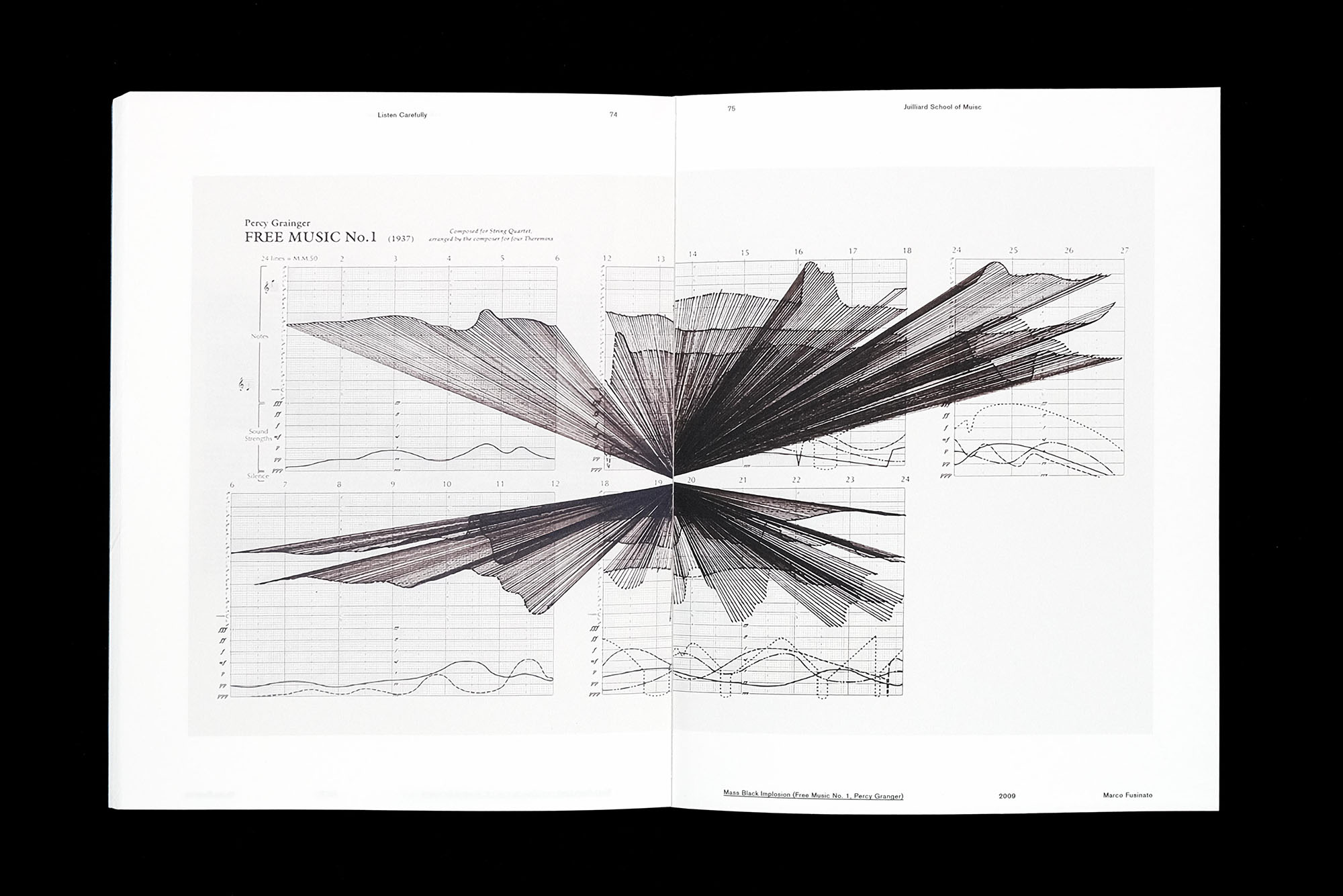
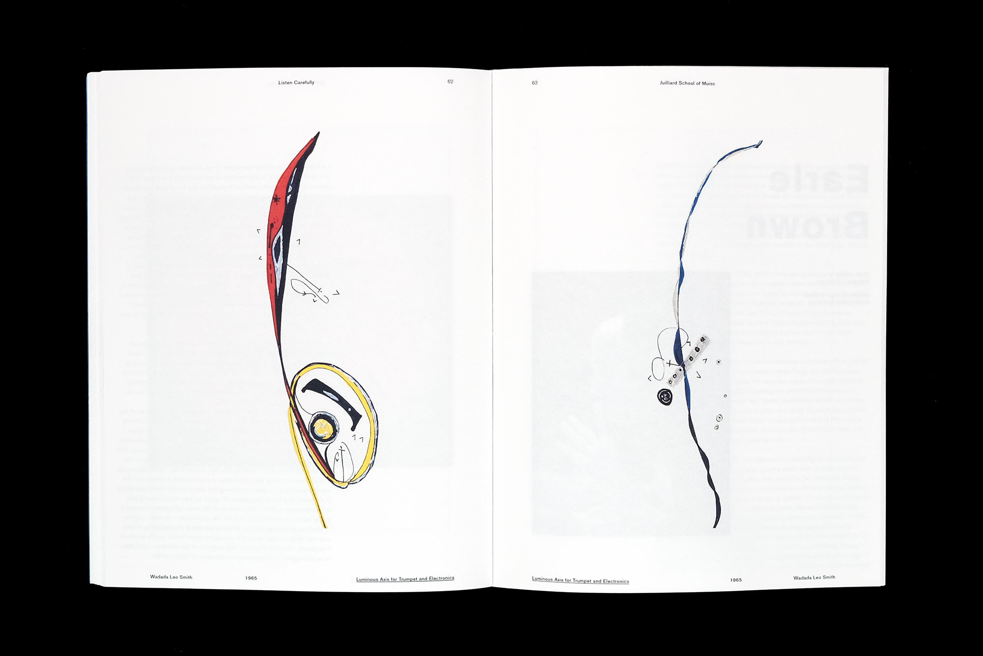
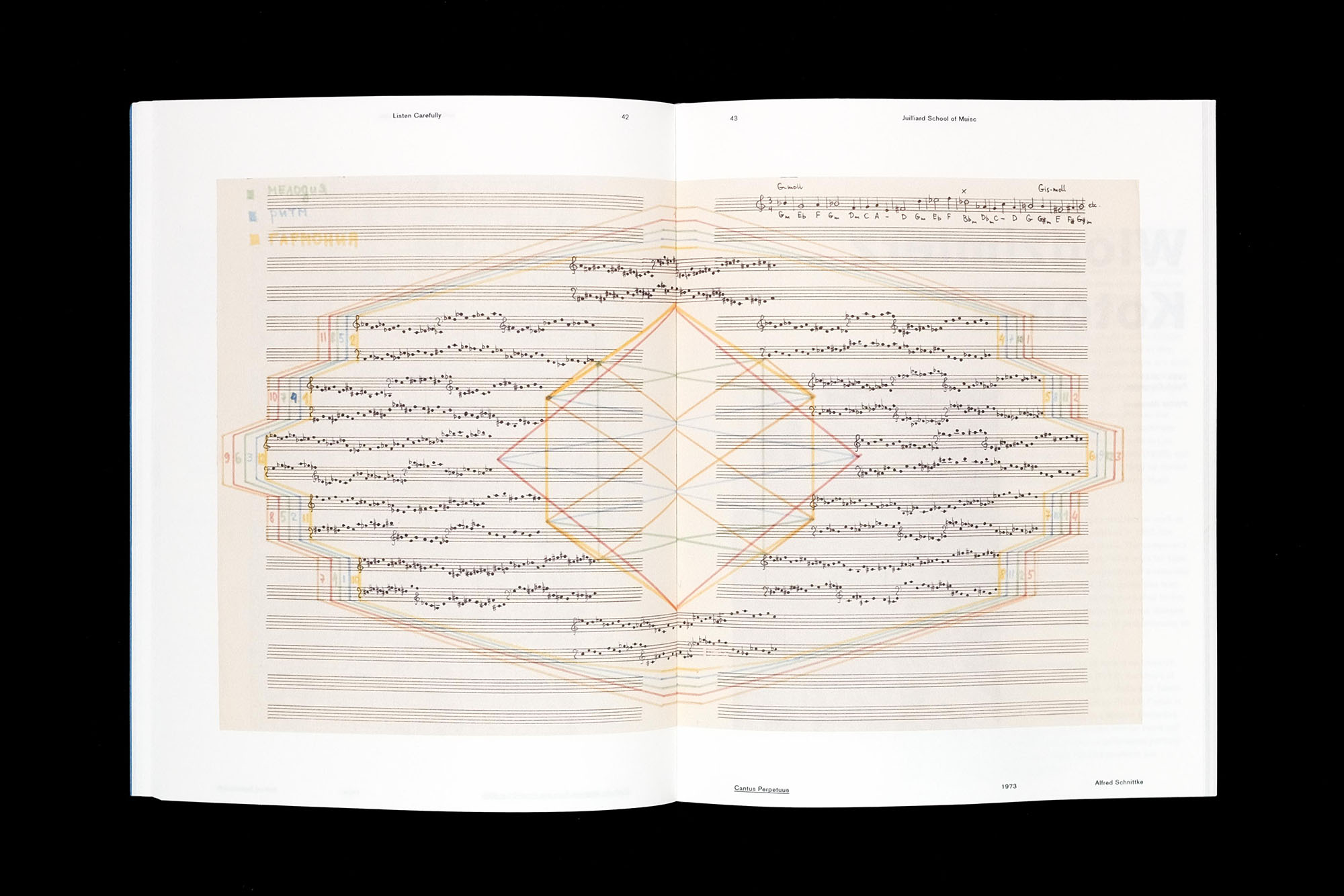
Graphic notation is the representation of music through visual symbols, capturing not only the auditory but also the emotional characteristics that music embodies.
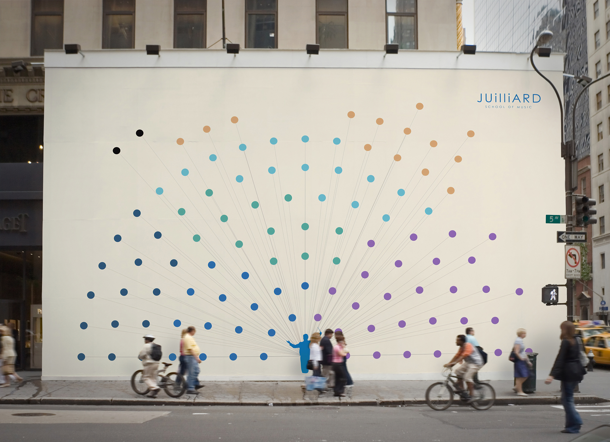
The Juilliard School of Music is enriched with history, teaching some of the world's best musicians. To represent all the various attributes of Juilliard, a redesigned logo was necessary. The essence of the rebrand was inspired by visualizing the diverse sounds of Juilliard and its students, leading to the discovery of graphic notation and the different ways it's expressed as a visual and auditory component.
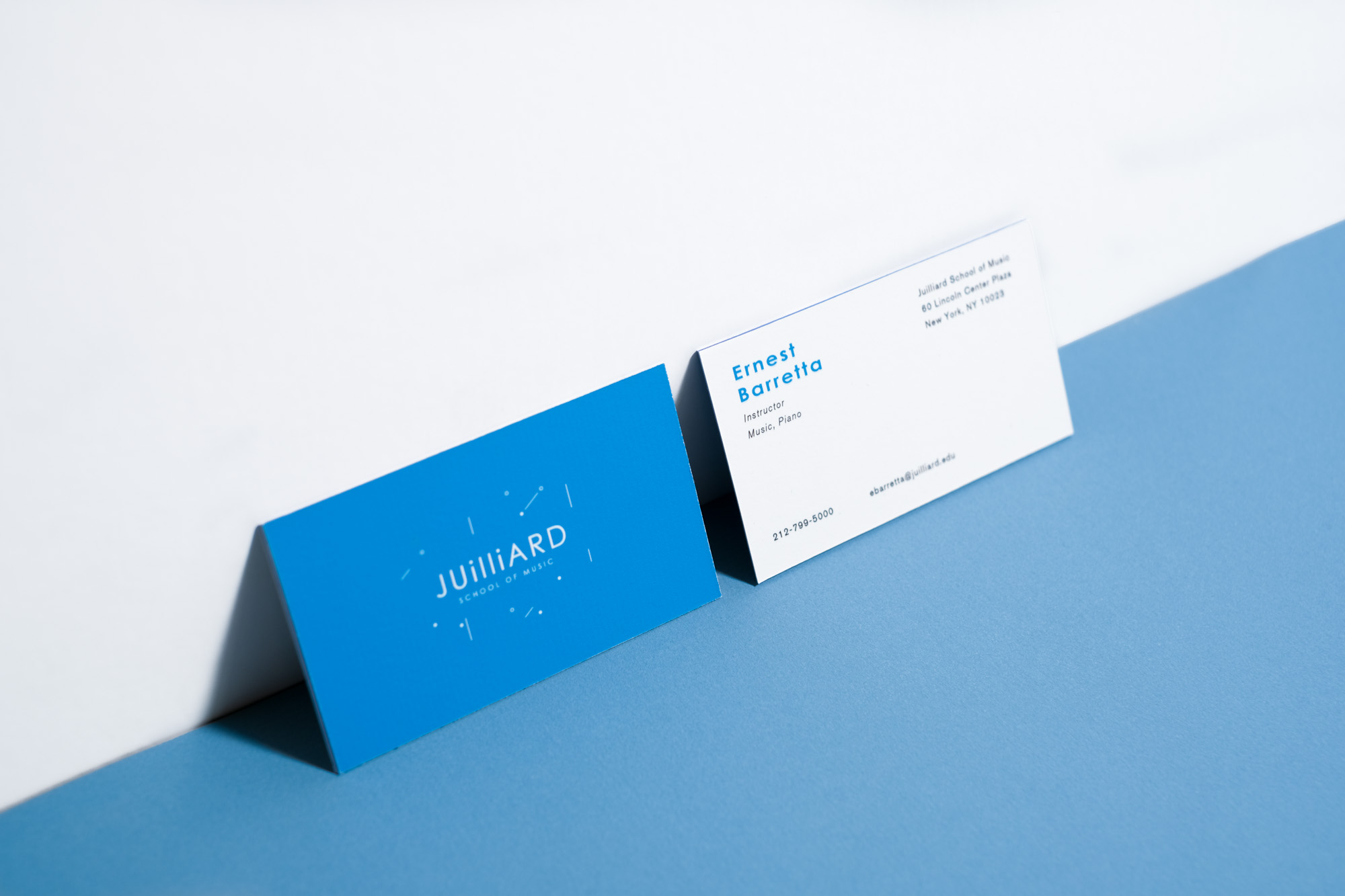
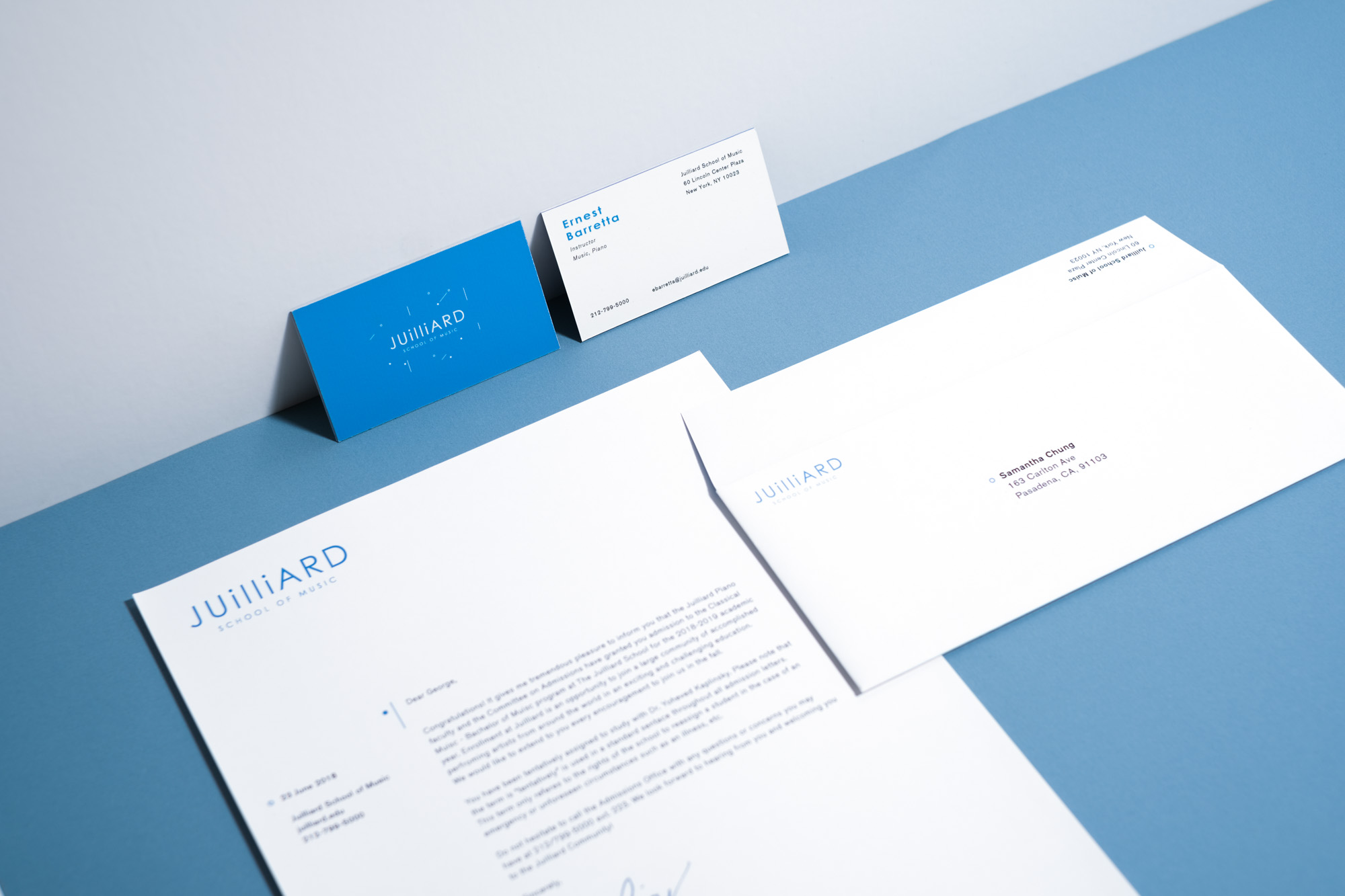
Identity Redesign
The old Juilliard logotype with the redesigned logo lockup and animation of the design elements moving to the sound of an orchestra tuning.
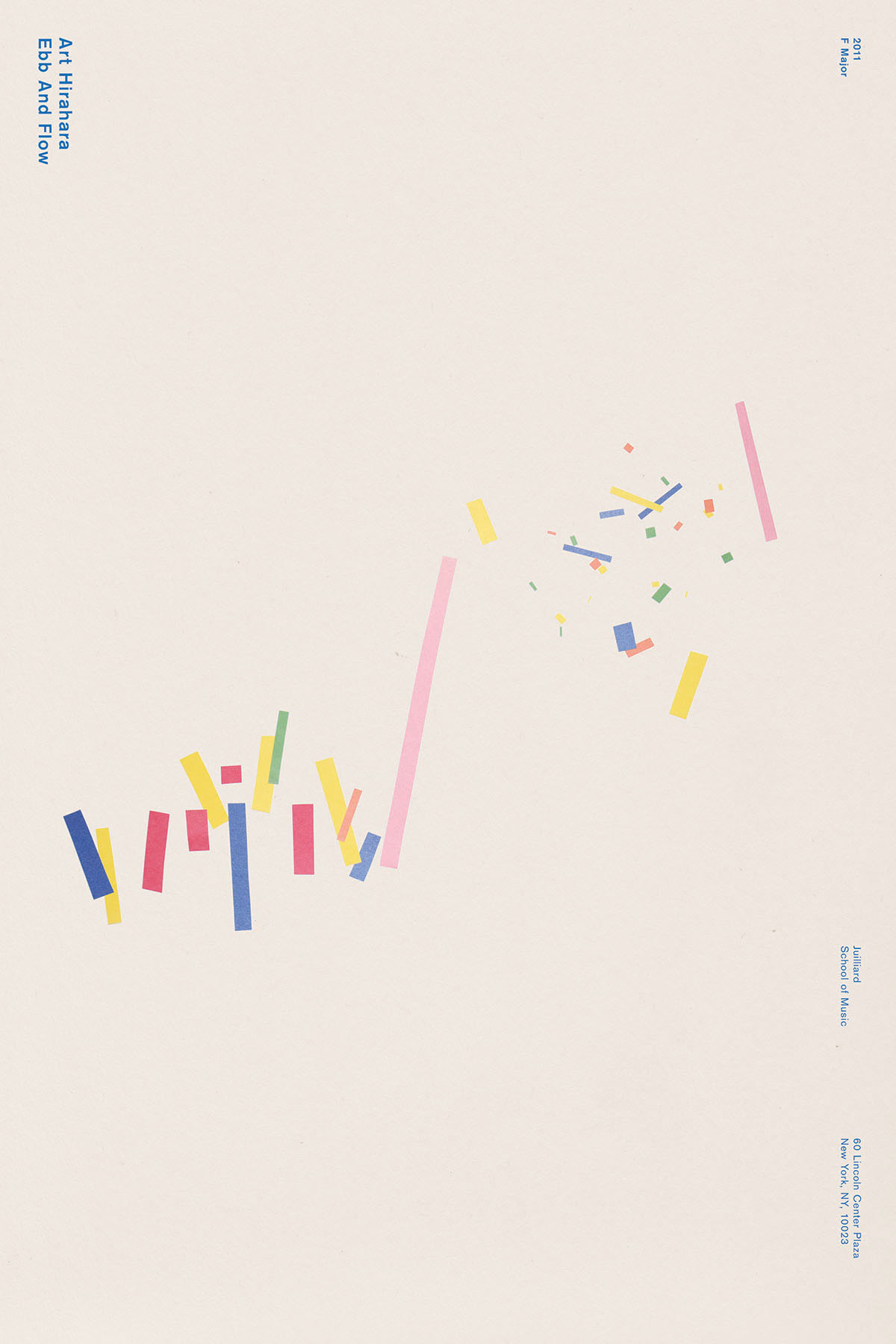
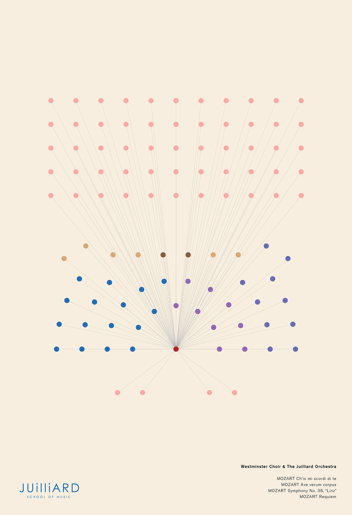
Poster Series
Two poster series were created to display the beauty of graphic notation and the role it plays as a visual medium in an auditory culture. One poster seires visualizes three different genres of music and expresses the energy and sound through colored paper. The second series is a distilled infographic perspective of diffrernet musical ensambles.


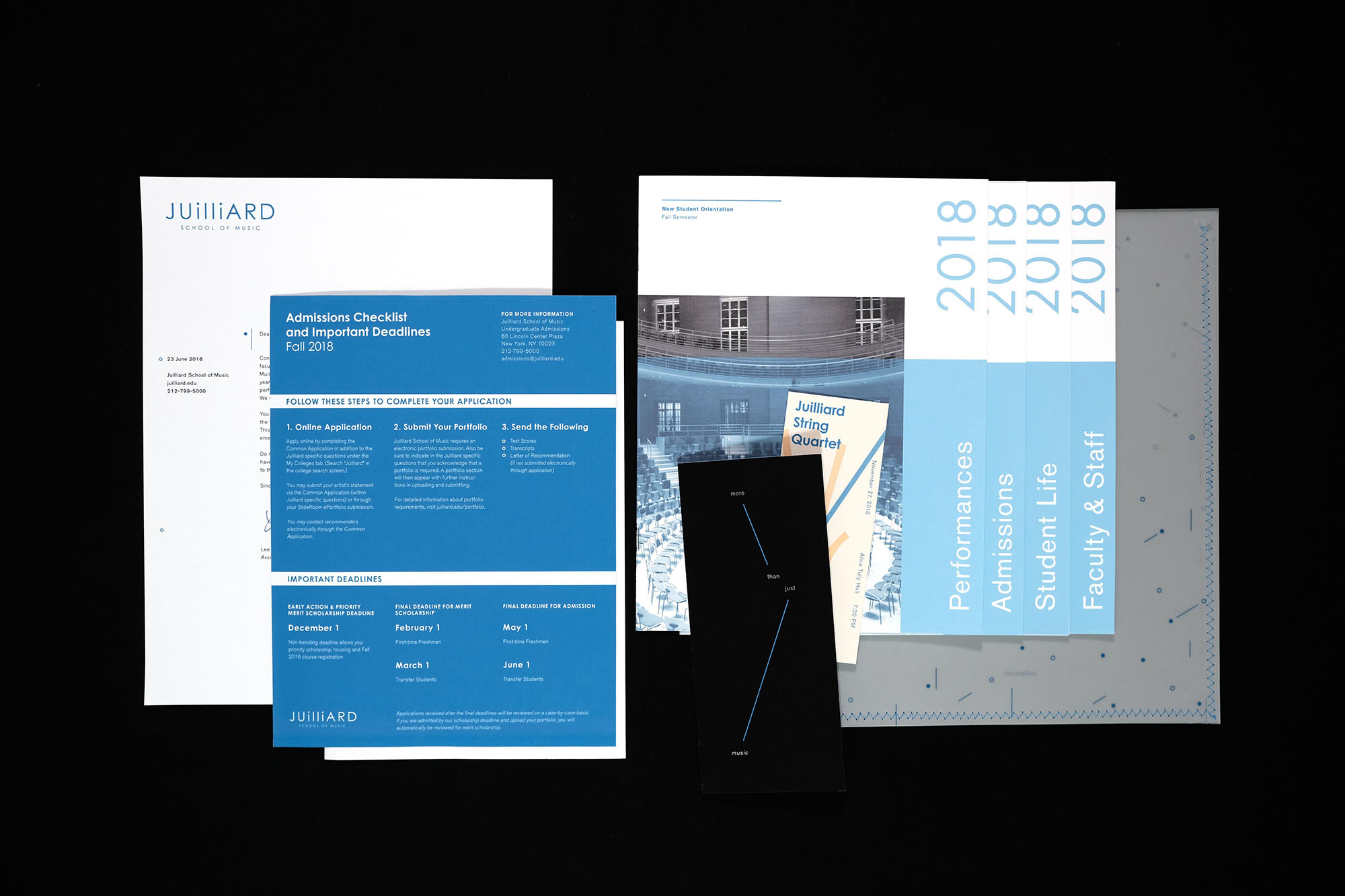
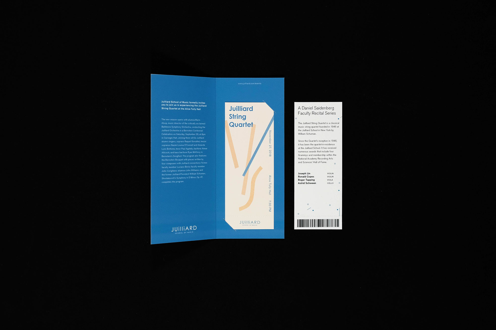
New Student Mailable Welcome Packet
Incoming Juilliard students will recieve a mailed package that provides students with information on their financial checklist, admissions, student life, faculty, and performances. In addition, students will recieve a complementry ticket to a Juilliard orchestra performance and a 13x19 wall poster.
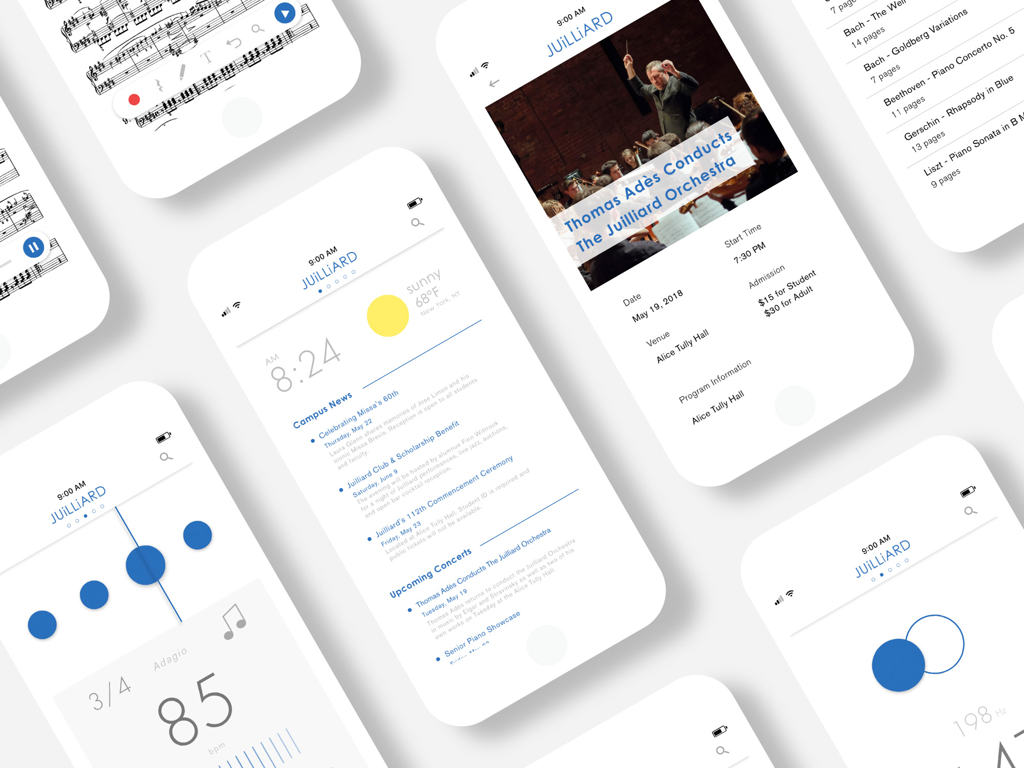
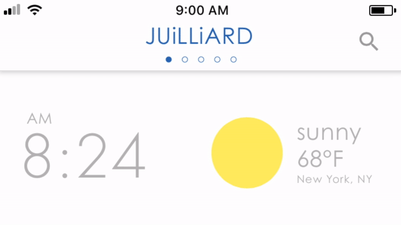
Mobile Applications
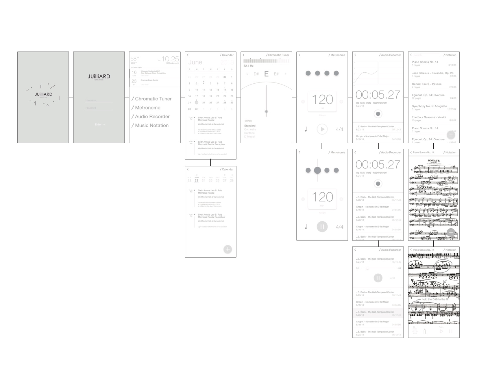
The Juillard School of Music app will contain everything an aspiring musician would need; campus concerts and recitals, chromatic turner, metronome, the school’s vast database of sheet music, and an audio recorder.
Coded and designed in Framer.
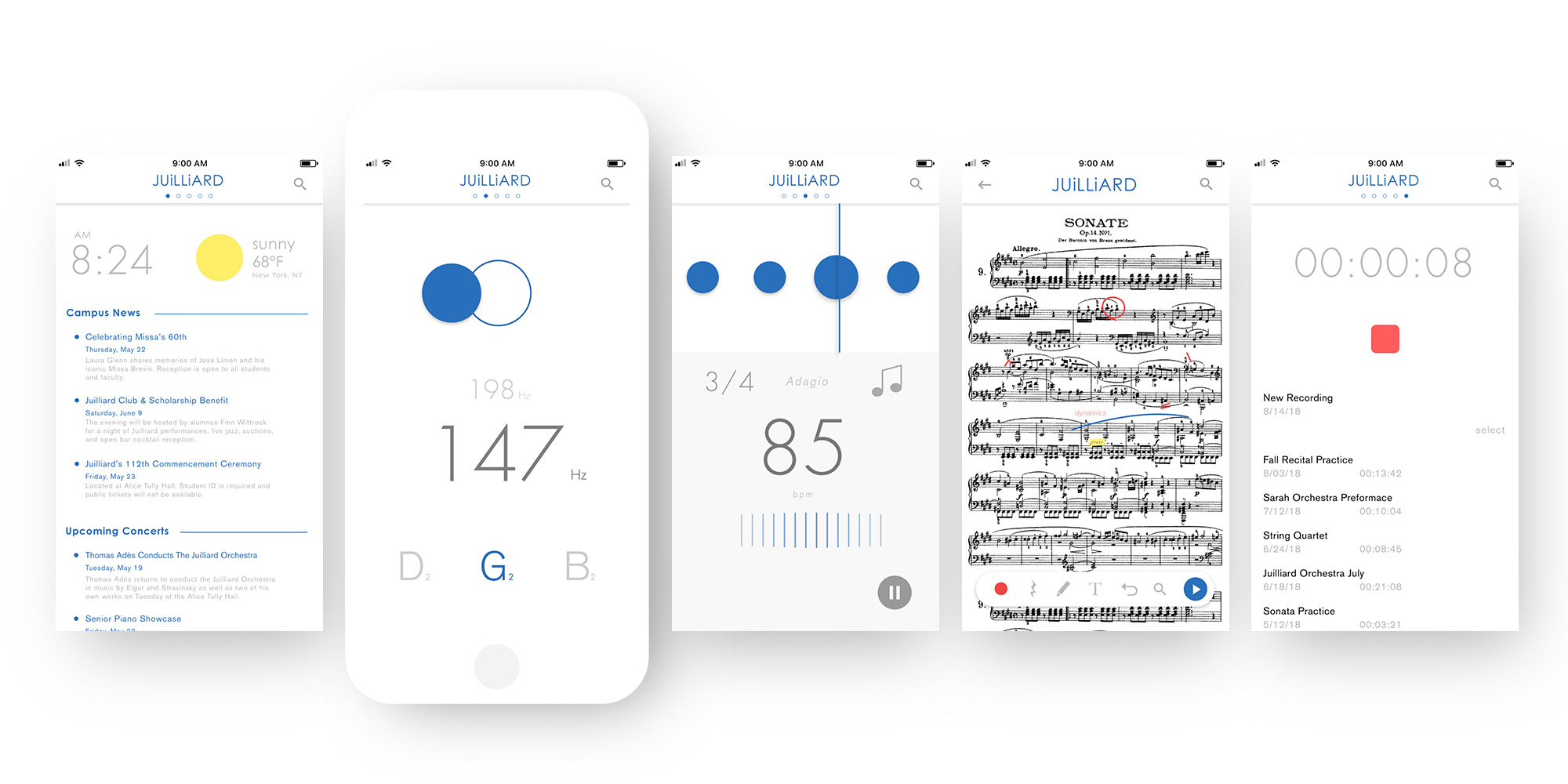


Micro Interactions
A few of the responsive micro interactions are a responsive header, a floating action button (FAB) that provides different actions, and fully responsive keyboard input.
Editorial
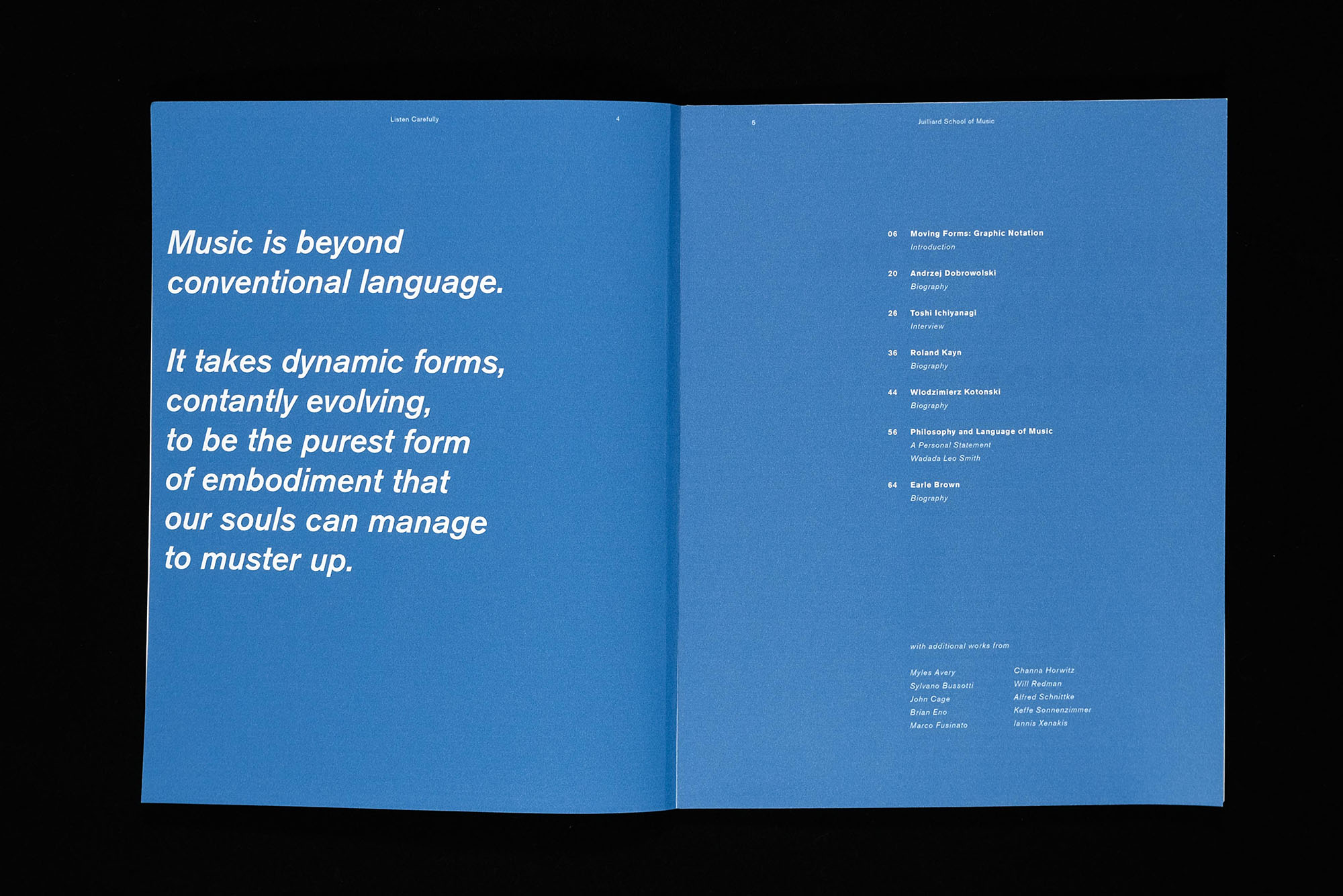
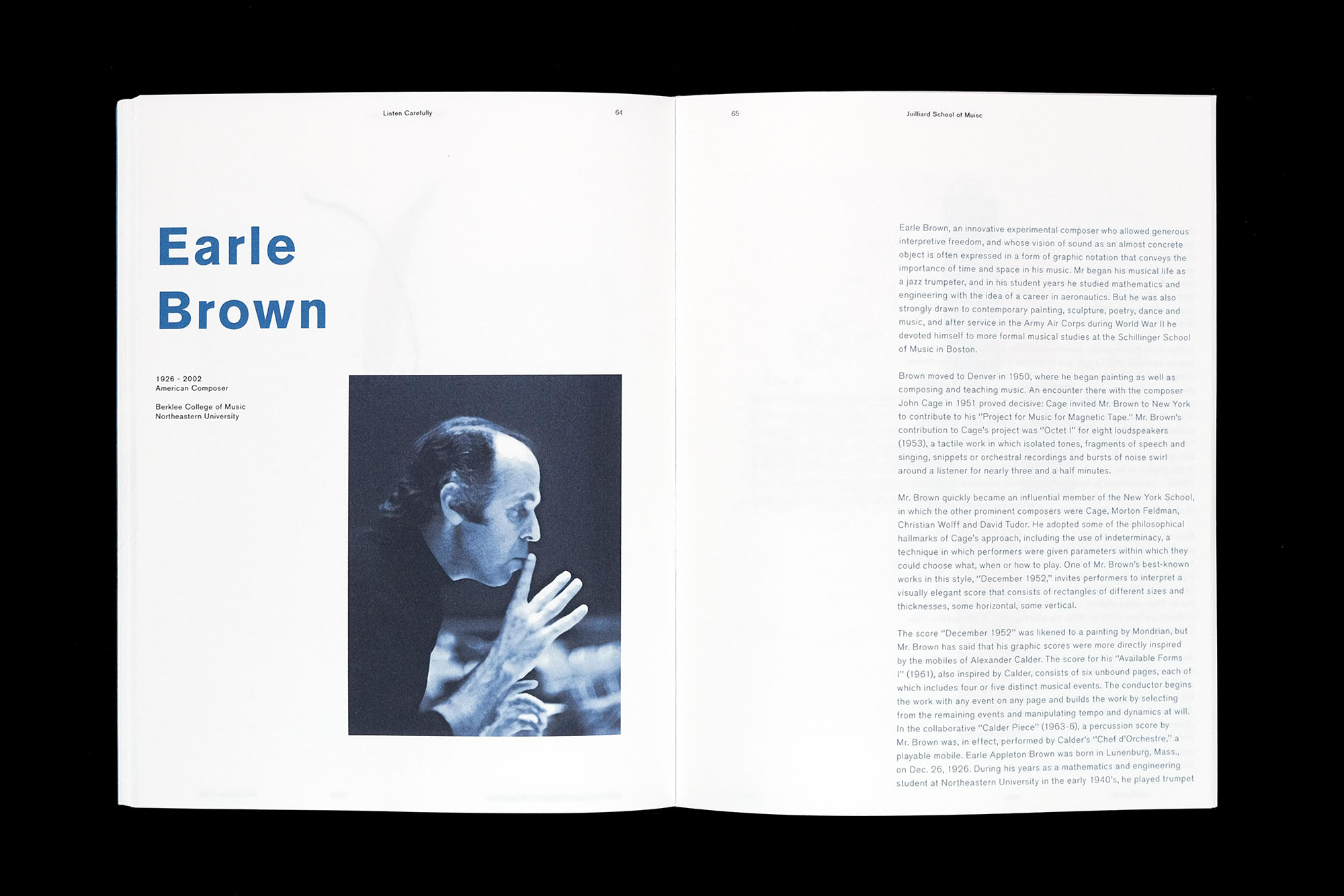
Listen Carefully is an editorial peice that explores the depth of graphic notiation and the different ways composers and artists visualize music.


Outdoor

Spatial
A spatial projection is controlled by a user’s input on a piano. Each individual key on the piano is visualized in size, color, and location, visualizing music and sound into a singular experience. The generative code was made in Processing.
Print Collateral


Process
This was an exercise to visualize how sound and different music could play a informational and emotioanl role to different audiences. Similar to that of music notation, generative forms were created through code using Processing.


Raining Cats & Dogs
interaction. code.
It's raining cats and dogs! Play as Superman to save as many pets as you can. Be sure to keep an eye out for traffic and oncoming airplanes!
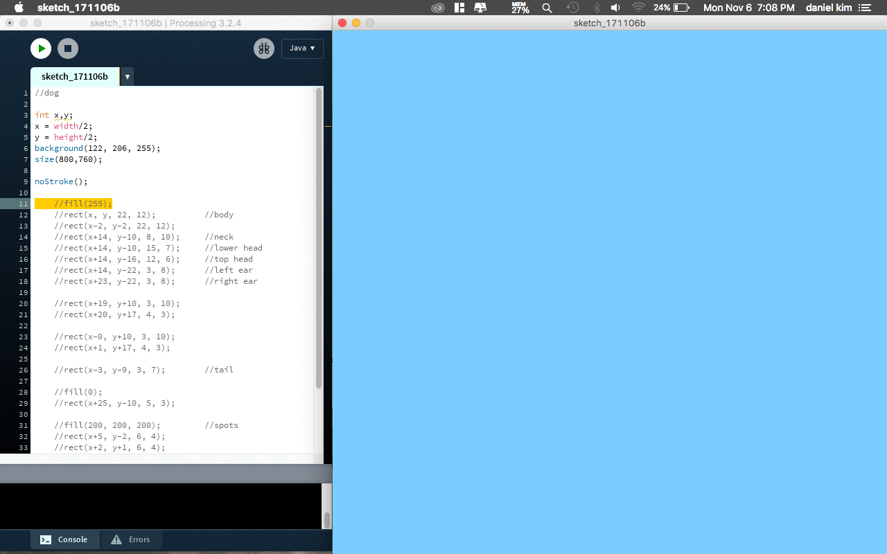
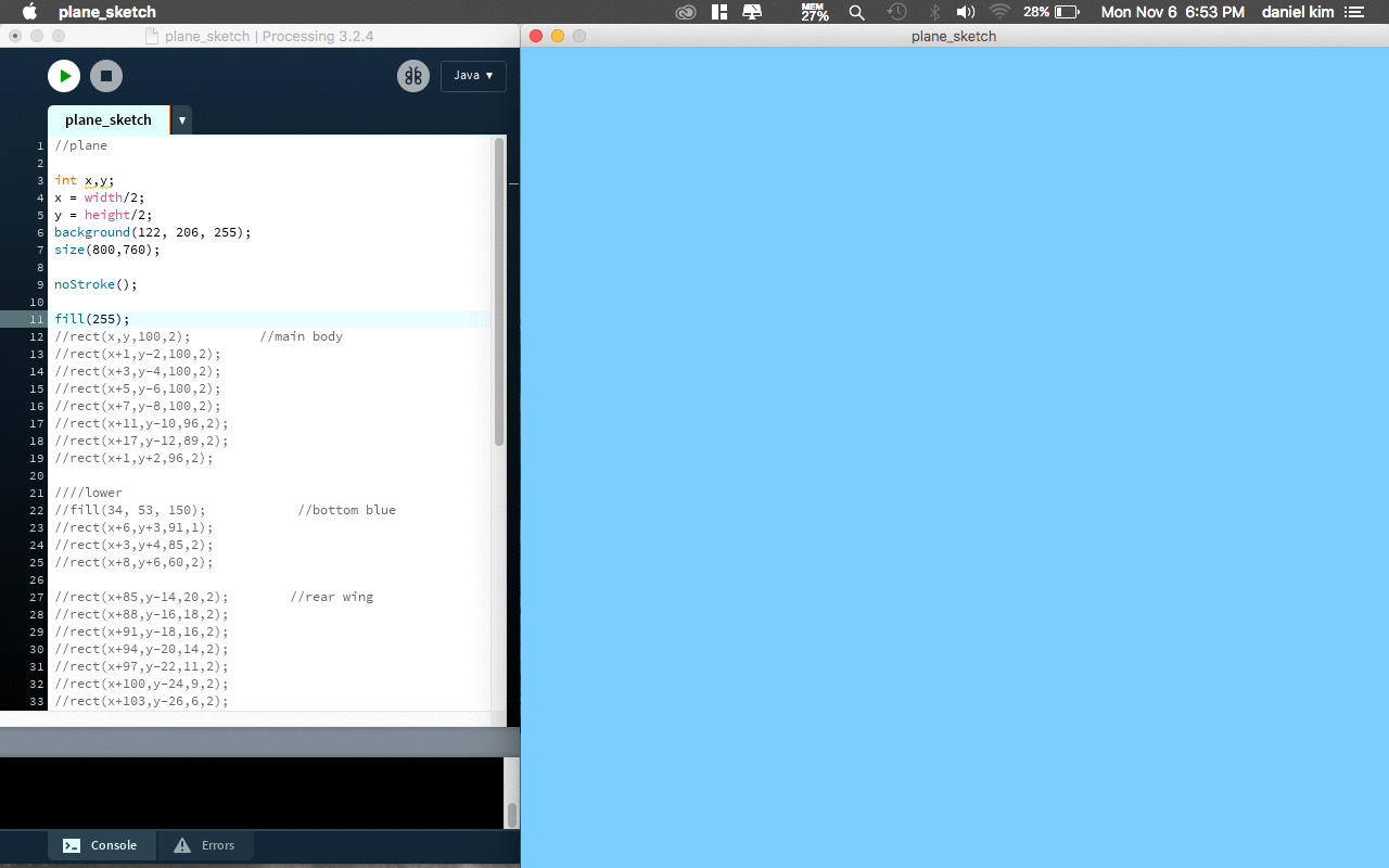
play.
Raining Cats & Dogs was designed and coded with Processing, a digital language born from Java. This game utilizes the simplicity of the arrow keys to interact with the elements in the game that are generated by the code created in Processing.
Game Play
Visual Elements
Each element was constructed entirely of rectangles (for proper 8-bit nostalgia) with a paralax skyline as the background.
![]()
![]()
![]()
Visual Elements
Each element was constructed entirely of rectangles (for proper 8-bit nostalgia) with a paralax skyline as the background.

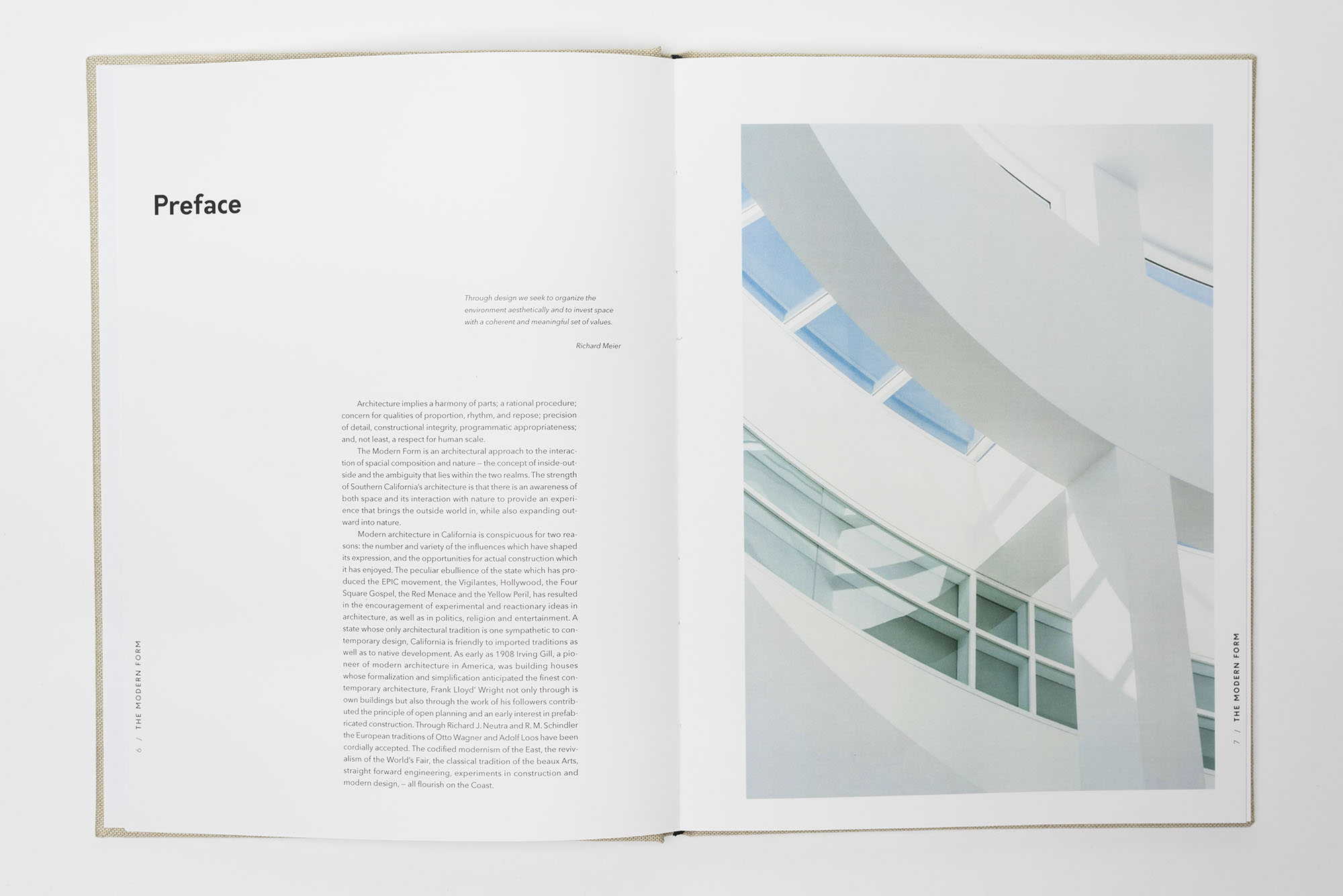
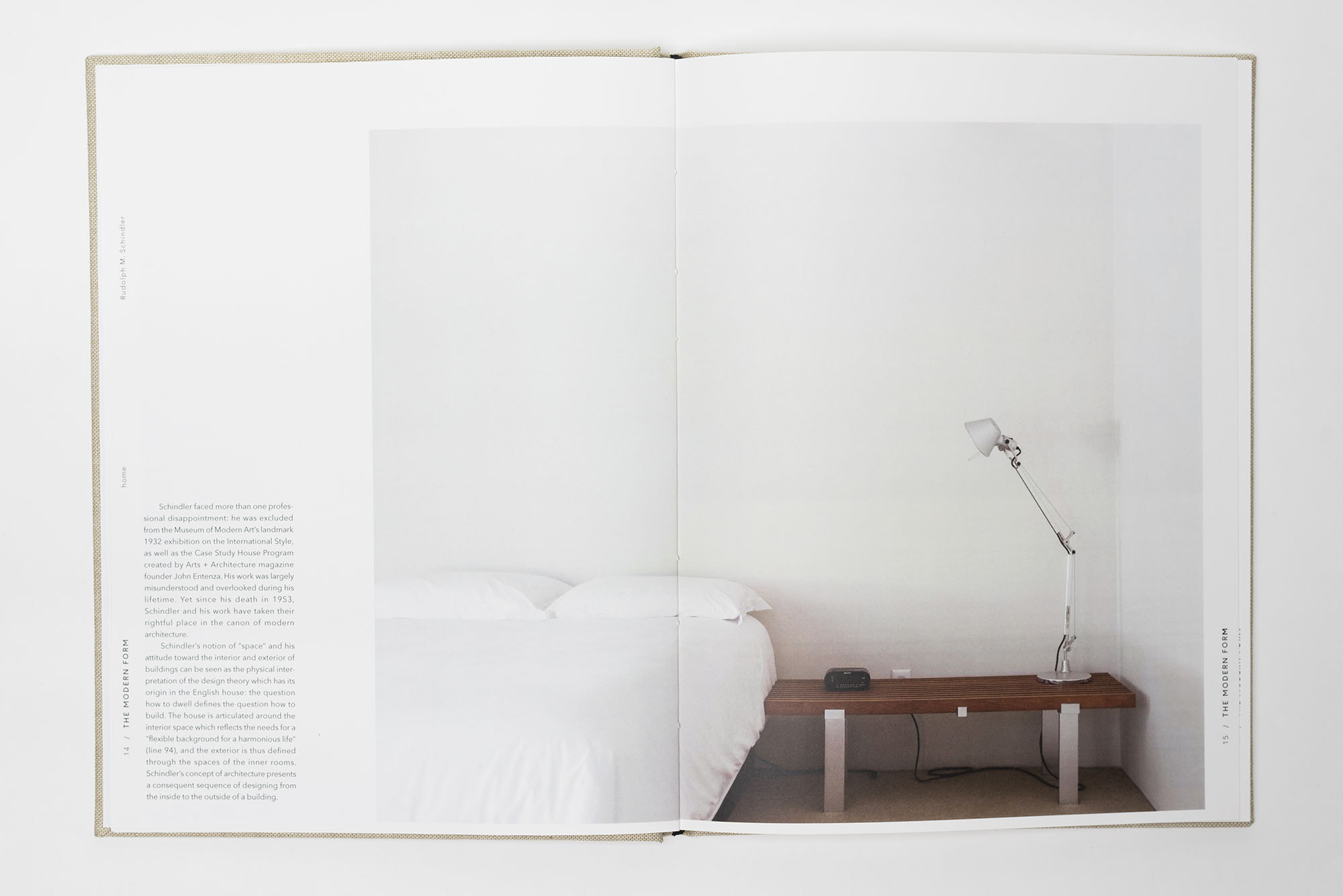
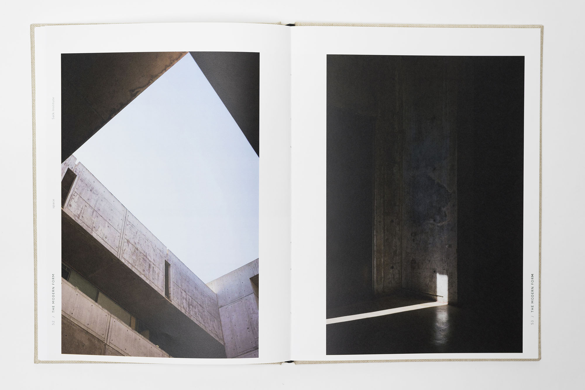
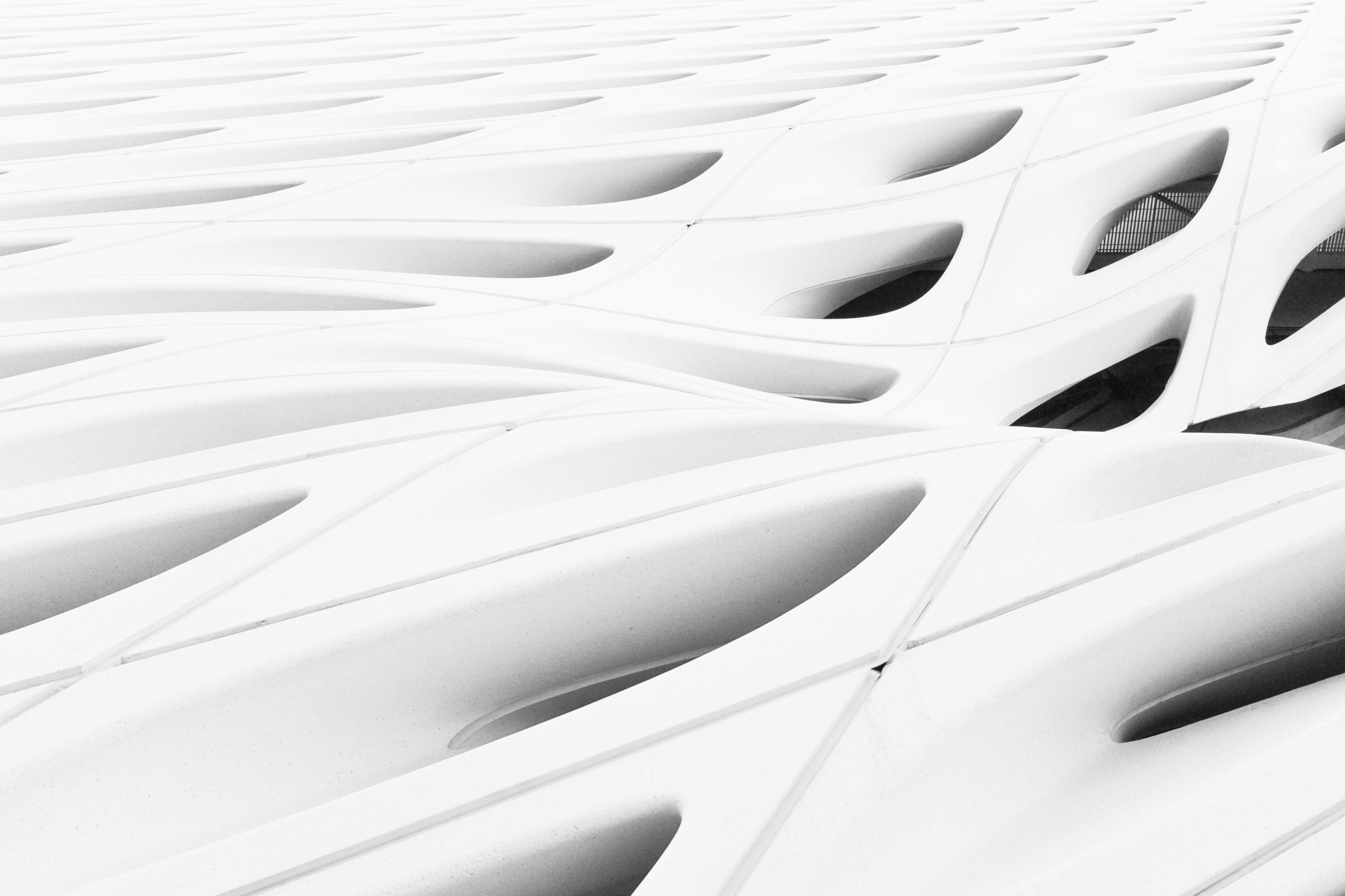
The Modern Form
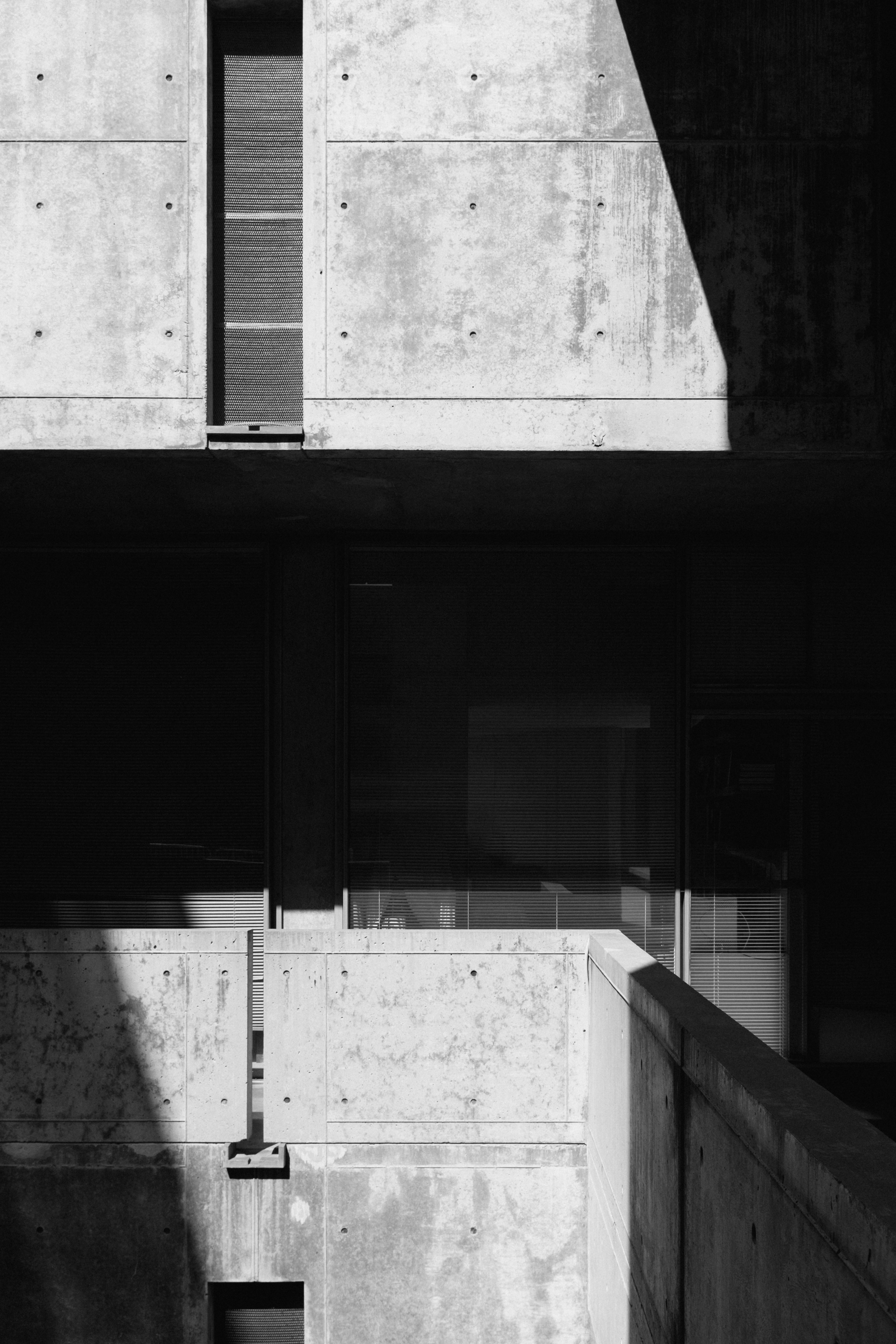
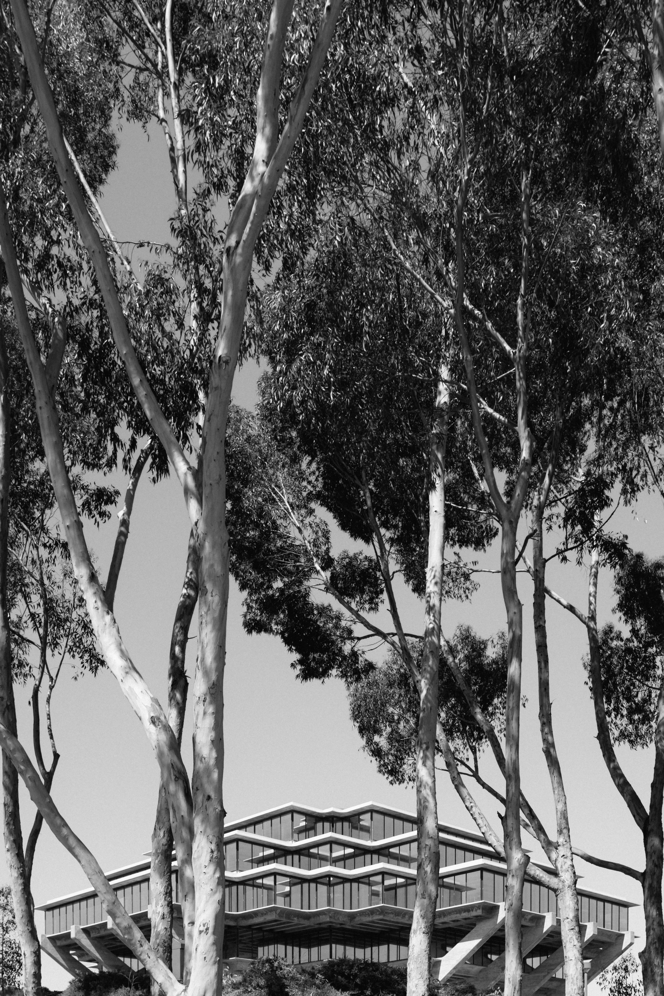
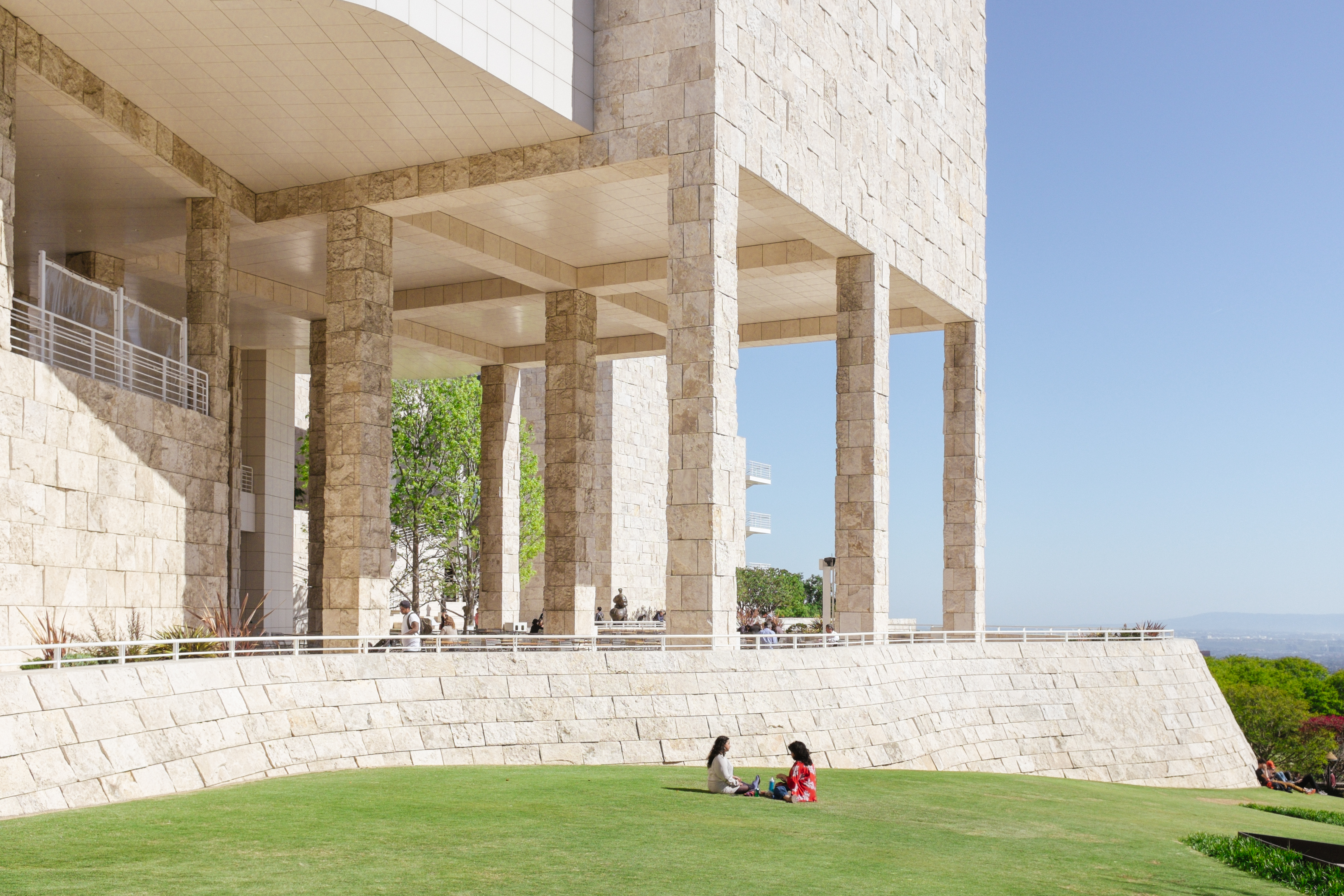
print. photo.
The Modern Form is an architectural approach to the interaction of spacial composition and nature - the concept of seeing inside-out and the ambiguity that lies within the two realms.
The strength of Southern California's architecture is that there is an awareness of both space and its interaction with nature to provide and experience that brings the outside world in, while also expanding outwards into nature. This 96 page issue is a glimpse of five local architectural marvels in Southern California by architects such as Schindler, Neutra, Eames, and Meier.


Photography
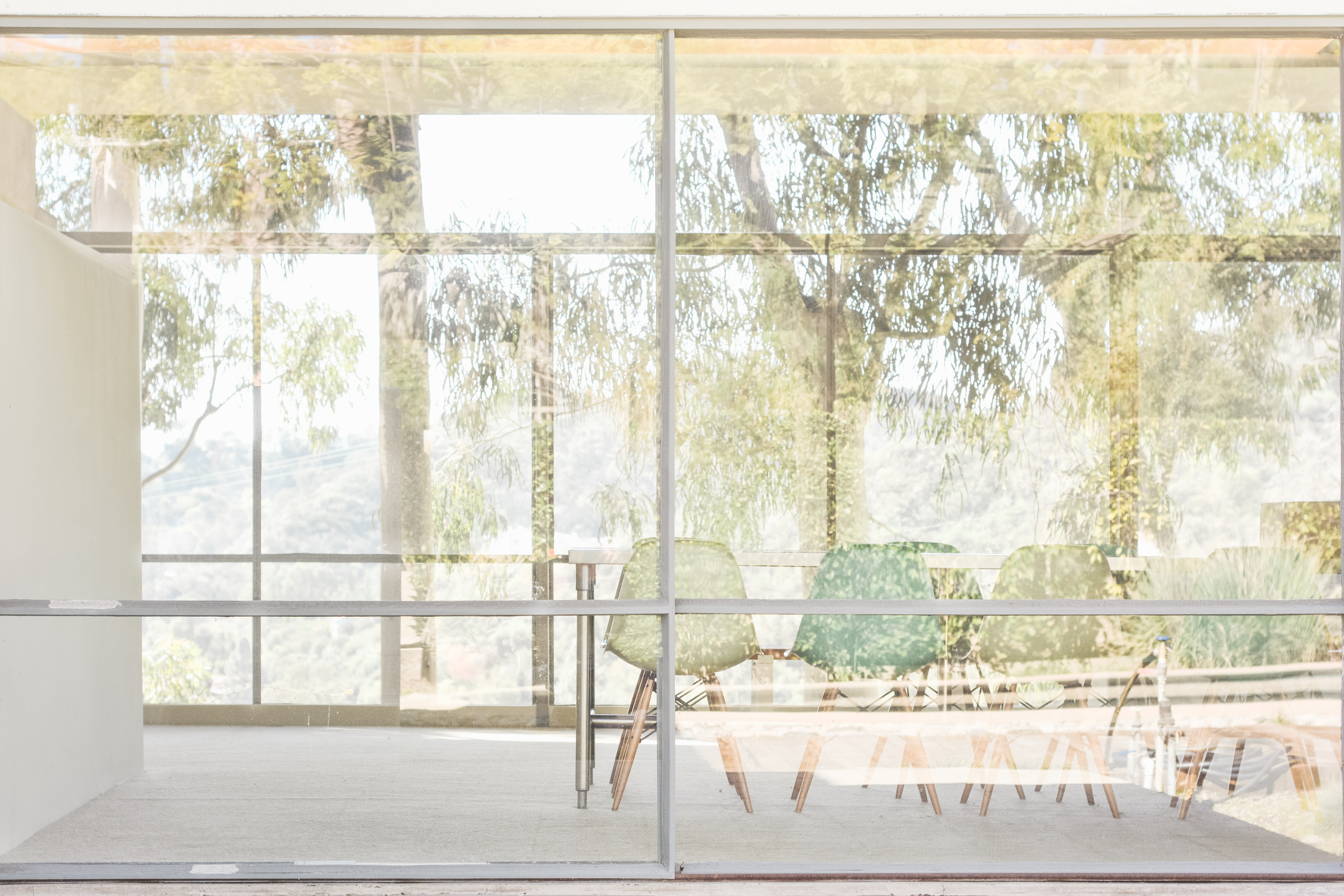
Posters
A series of three posters were created to embody the aspects explored in The Modern Form - home, city, and space. These photo posters give a distilled breif to the editorial while being a visually striking image in its simple compositions.